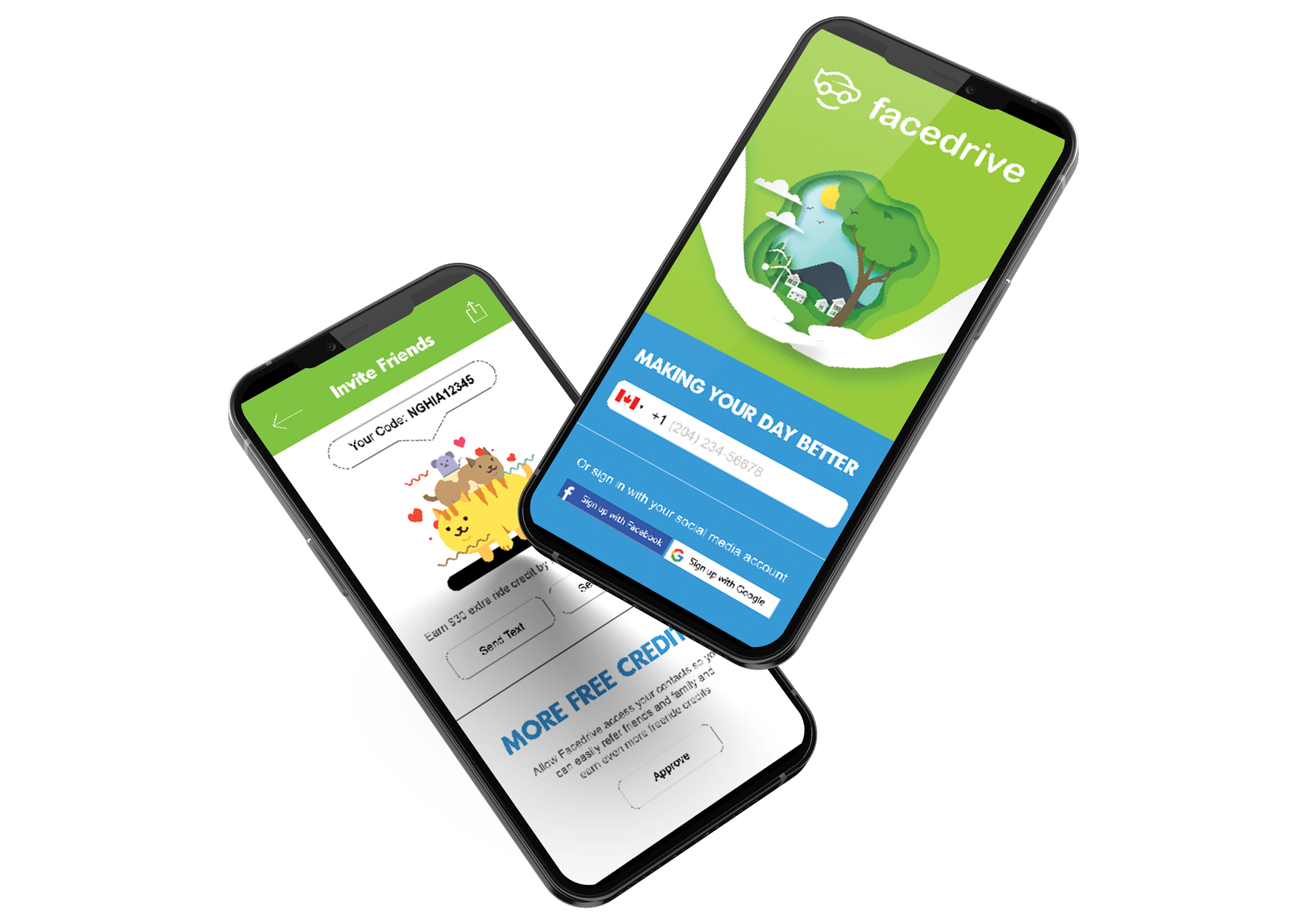
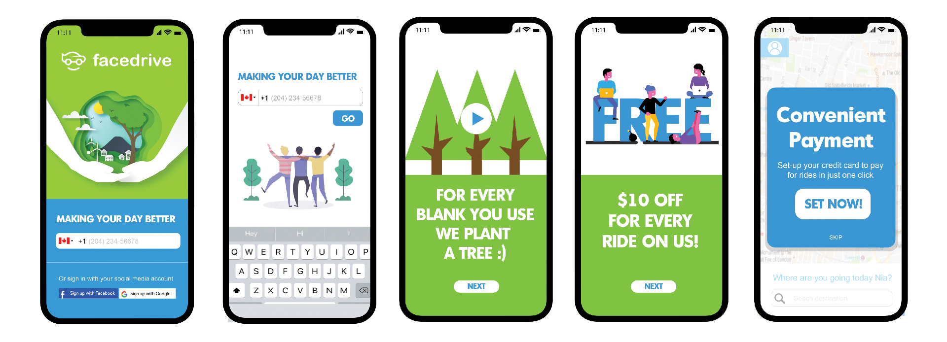
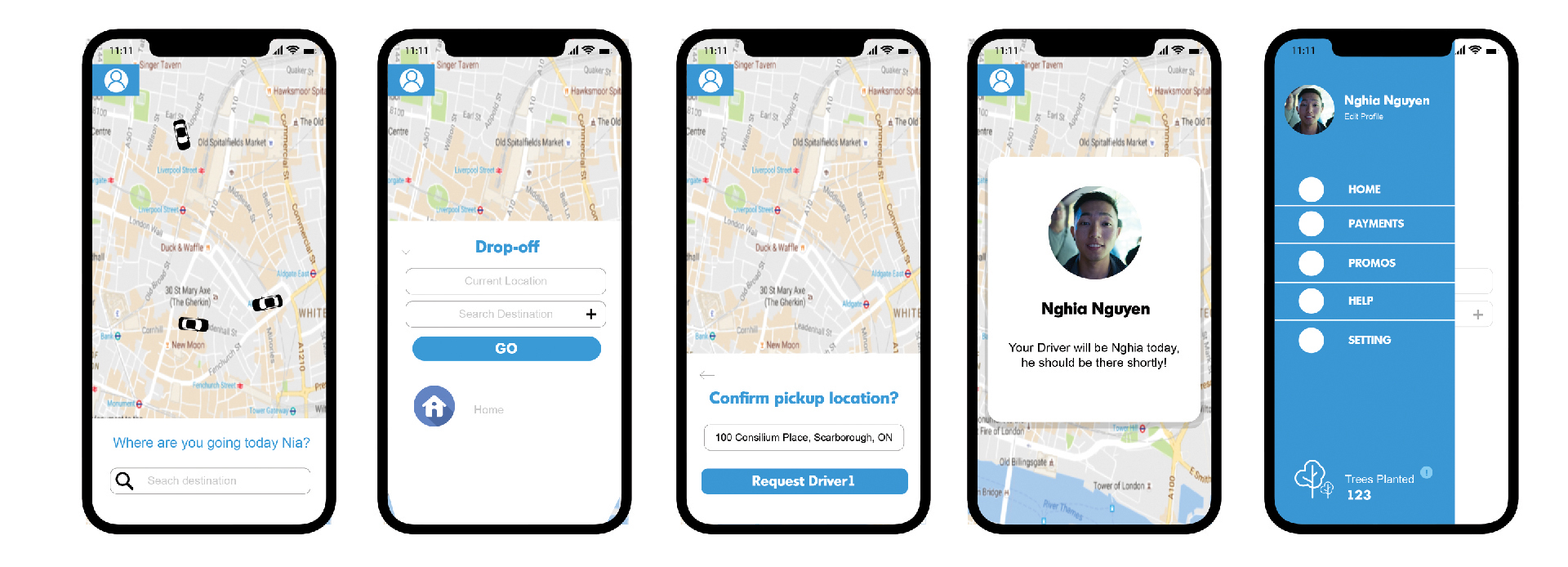
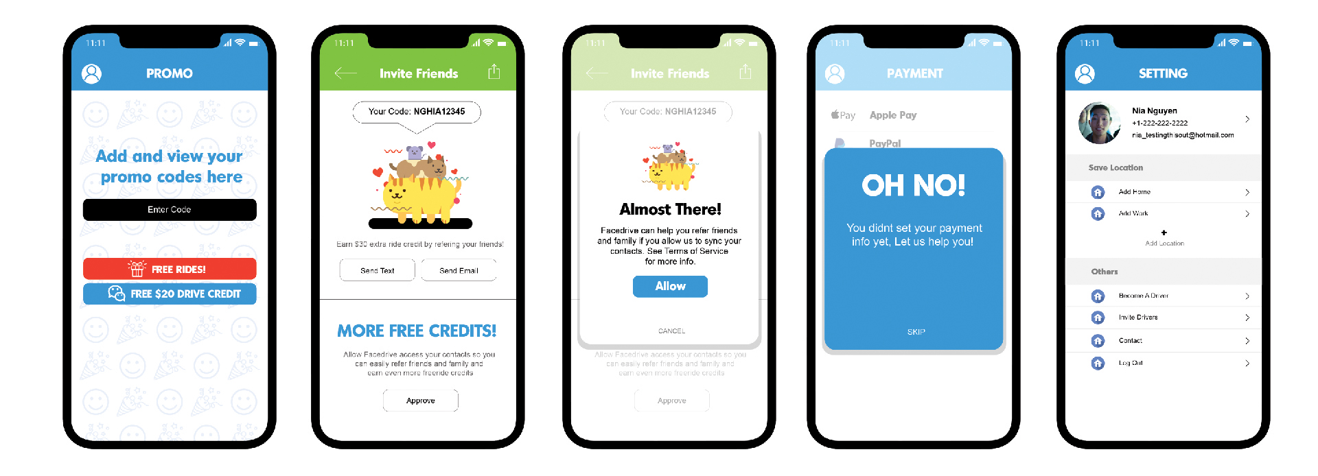
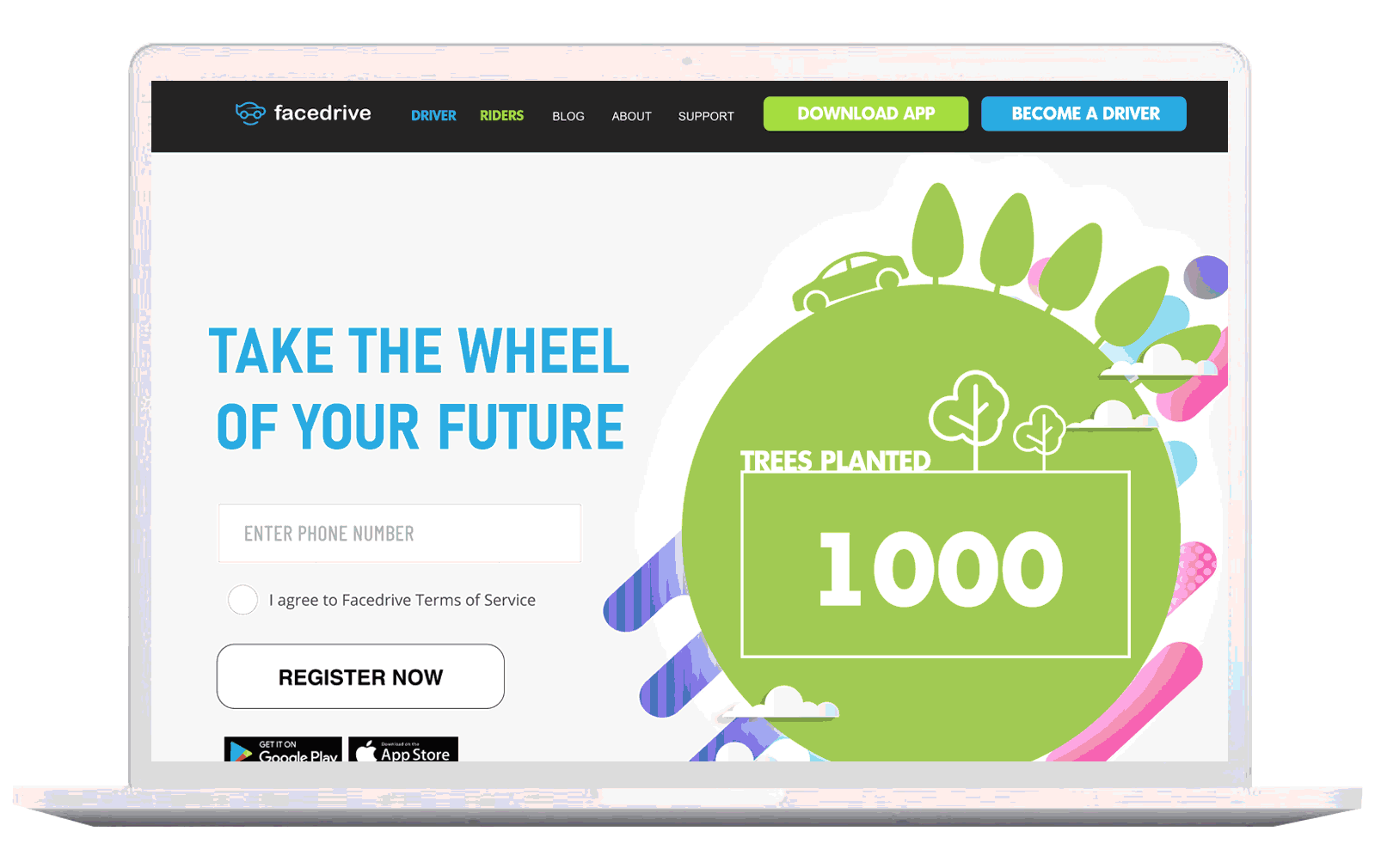
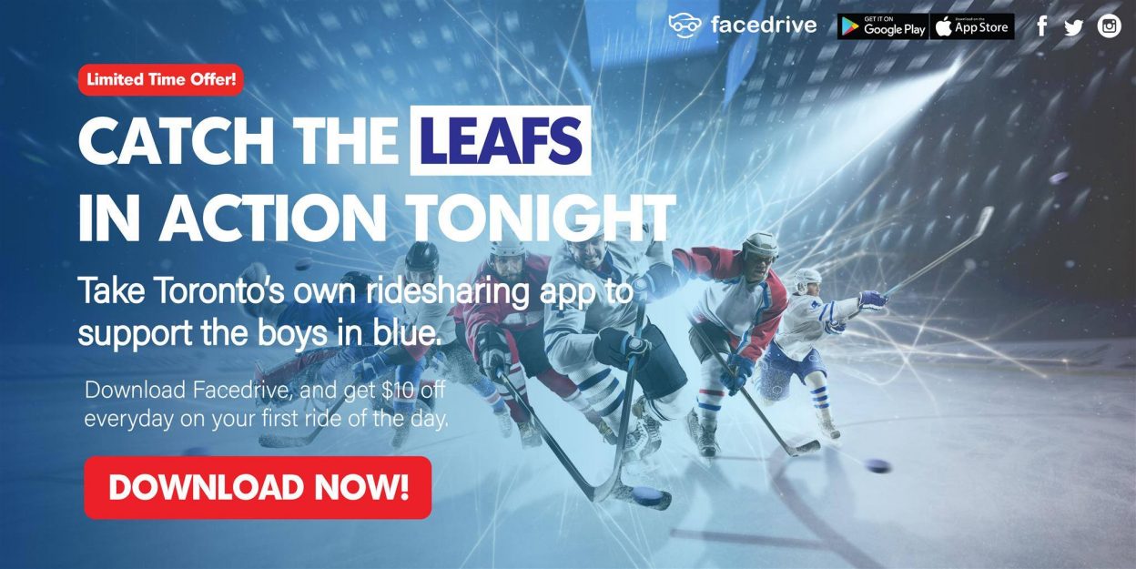
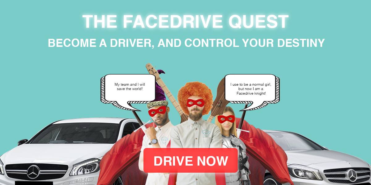
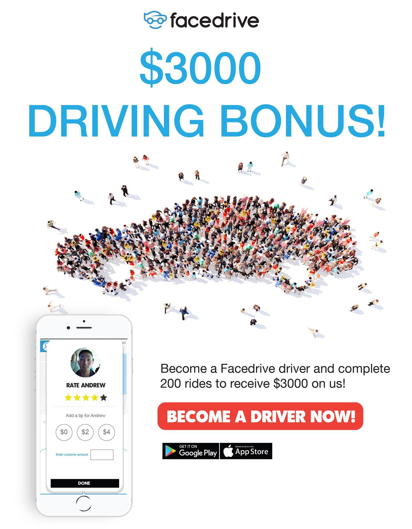
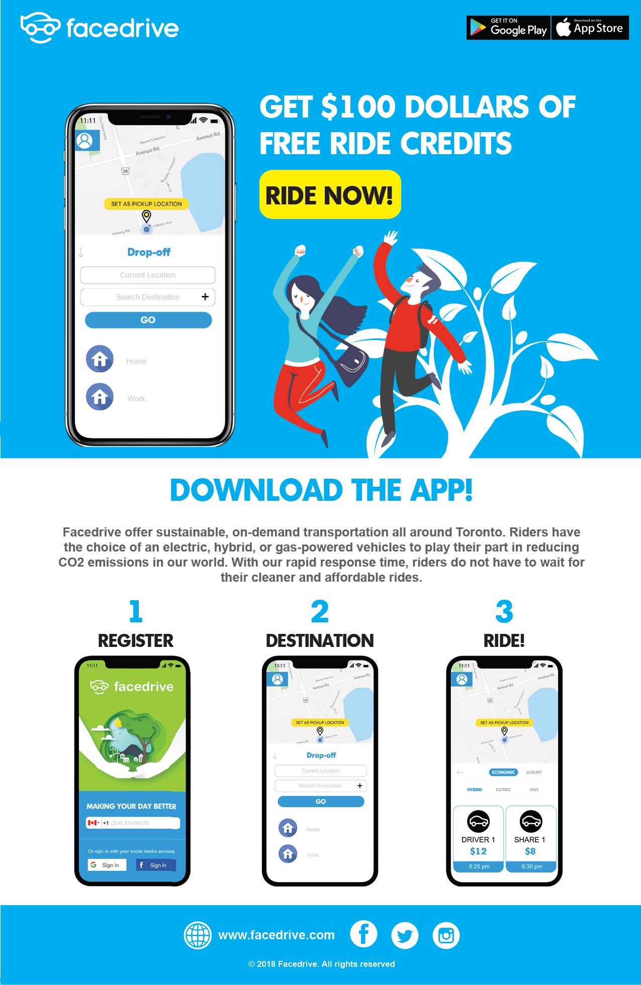
A complete UX/UI overhaul, digital marketing system, and brand campaign for a ride-sharing app committed to environmental action.
View Case StudyFacedrive is a Canadian ride-sharing platform built on a radical premise: every completed ride funds the planting of a tree. The vision was clear — but the product experience and marketing ecosystem needed to match the ambition.
As the designer on this engagement, I was responsible for the full visual stack: redesigning the companion app's UX, building a digital advertising system to recruit drivers, and creating print and email collateral that unified the brand across every touchpoint.
The challenge wasn't just aesthetic. It was about translating environmental conviction into a product that felt trustworthy, modern, and deeply motivated.
The gap between what Facedrive stood for and how it looked was significant. Here's what we set out to fix.
The app's visual language didn't communicate the environmental mission. Users had no way to feel the brand's green ethos through its interface.
The companion app relied on commodity UX conventions borrowed from mainstream ride-sharing — nothing that differentiated Facedrive in a crowded market.
The platform needed a steady supply of drivers, but lacked a compelling recruitment narrative or digital funnel to attract and convert them.
Social ads, printed brochures, and email blasts looked like they came from three different brands — undermining credibility with every impression.
The tree-planting pledge — Facedrive's most powerful differentiator — was buried in the UX. It needed to be front and center in every screen and touchpoint.
The design quality didn't signal premium enough to attract the target demographic: values-driven urbanites who expect polished digital experiences.
From understanding the brand's mission to delivering production-ready assets across every platform.
Studied Facedrive's environmental mission, competitive landscape, and existing digital touchpoints. Conducted heuristic analysis of the companion app and benchmarked against premium greentech brands.
Mapped the app's core flows — booking a ride, viewing environmental impact, driver onboarding — and redesigned the IA to put the eco mission at the center of every decision point.
Developed a custom illustration language — "Green to Blue" — that visualized the environmental impact of each ride, transforming a transactional app moment into an emotionally resonant experience.
Built high-fidelity screens for the companion app, designed a digital ad suite for driver recruitment, created print brochures, and designed the email marketing series — all from a unified design system.
Delivered all production-ready assets with developer documentation for the app screens, print-ready files for brochures, and optimized exports for digital campaigns across all platforms.
A unified visual language built from Facedrive's core identity: deep greens, dark surfaces, and eco-forward typography.
From app screens to ad campaigns — every surface redesigned with intention.
The core innovation: weaving eco-impact data directly into the booking flow using custom illustrations, so the tree-planting pledge isn't a footnote — it's the emotional peak of every ride.
Each design decision was in service of one goal: making environmental impact tangible and beautiful.
A live tree-count displayed at booking confirmation, showing users their cumulative environmental impact across every ride.
Custom environmental illustrations woven through the ride booking experience, transforming a transactional moment into an emotional brand story.
A full-funnel digital advertising campaign targeting driver demographics with social ads, landing pages, and recruitment-focused creative.
Three-part email campaign series designed for rider engagement, driver onboarding, and eco-impact reporting — all on-brand and high-converting.
Front-and-back brochure designed for physical distribution at driver recruitment events, with eco-forward messaging and clear CTAs.
One visual language applied across all six platforms: app, web, social, email, print, and OOH — eliminating brand fragmentation at its root.
Measurable outcomes across every platform and marketing channel.
Facedrive was a project where the mission preceded the medium. The most important design decision wasn't which green to use — it was how to make an environmental pledge feel real inside a 3-inch screen.
Working across app, digital, print, and email in a single engagement forced a systems mindset from day one. Every component had to work in context of all the others. That constraint made the work better.
When a brand has a genuine purpose — planting trees, reducing emissions — that purpose isn't just marketing copy. It's a design constraint, a UX hook, and an emotional amplifier. Use it.
When the app looks different from the ads, and the ads look different from the emails, trust erodes with every impression. A shared design system isn't overhead — it's brand insurance.
Stock photography couldn't carry the environmental storytelling load. Custom illustration — even simple ones — gave the brand a voice no competing ride-sharing app had.
Designing for drivers — recruitment ads, onboarding materials, app flows — required understanding a completely different mental model than the rider experience. Treating it as a separate design challenge produced much better results.