Designing a modern, trust-first payment experience for property management — from acquisition to move-out.
APT Pay is a B2B SaaS platform built for property management companies. At the time of engagement, the product had strong backend infrastructure but lacked the user experience to match its technical ambitions.
Property managers were navigating fragmented workflows across spreadsheets, legacy portals, and disconnected payment tools. Residents experienced friction at every touchpoint — from application to monthly rent, maintenance requests to move-out refunds.
My mandate was clear: redesign the entire product experience. Build a cohesive design system. Create interfaces that felt as premium and trustworthy as the payments flowing through them.
APT Pay's platform handled millions in transactions, yet felt like software from a decade prior. User interviews surfaced consistent pain points across every persona.
Property managers switched between 4–6 disconnected tools to complete a single leasing cycle. No unified data, no shared context.
Residents reported anxiety around digital rent payments. Vague confirmation states, no audit trail visibility, unclear status messaging.
Finance teams lacked real-time cash flow dashboards. Reporting was manual, error-prone, and always a day behind reality.
Residents expected a native-quality mobile app. The existing solution was a broken responsive port that failed on most devices.
FINTRAC and PCI-DSS requirements created visual noise. Disclosure-heavy flows scared off users at critical conversion moments.
Slow-loading, unoptimized screens made users second-guess whether their payment had gone through — leading to duplicate submissions.
"How might we make complex financial transactions feel as simple and trustworthy as sending a text message?"
Every decision was grounded in evidence. I ran generative and evaluative research in parallel with design — keeping the team aligned and moving fast without cutting corners.
Conducted 14 stakeholder interviews across property managers, residents, and finance teams. Built journey maps exposing 23 distinct pain points. Competitive analysis of 8 fintech and proptech platforms revealed opportunity gaps in onboarding, payment confirmation, and reporting.
Rebuilt the IA from scratch. Card sorting sessions with 12 participants validated new navigation models. Reduced primary navigation from 11 items to 5 core areas without losing functionality — by surfacing context-relevant actions inline.
Low-fidelity wireframes for 40+ screens across three surfaces — property manager dashboard, resident portal, and mobile app. Key flows: onboarding, rent payment, lease signing, and financial reporting. Each flow pressure-tested against edge cases and error states before moving to hi-fi.
Built APT's design system from zero — tokens, components, patterns, documentation. Every component was built in Figma with variant sets covering all states: default, hover, focus, error, loading, disabled. Engineers received a Figma file they could read like a spec sheet.
Interactive prototypes for all critical paths tested with 8 users per round. Two rounds of usability testing revealed specific friction points in the payment confirmation flow and the lease-signing wizard. Both were iterated within the sprint before handoff.
From the banking app interface to credit card design and full marketing campaign — every touchpoint crafted with intention.
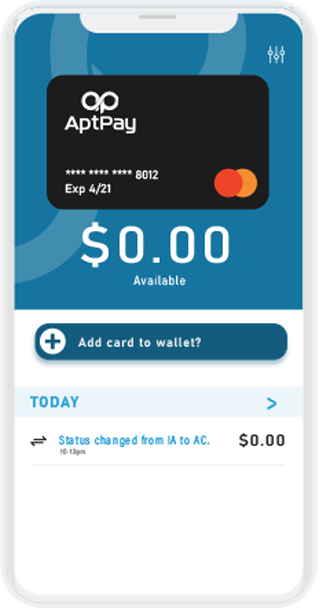
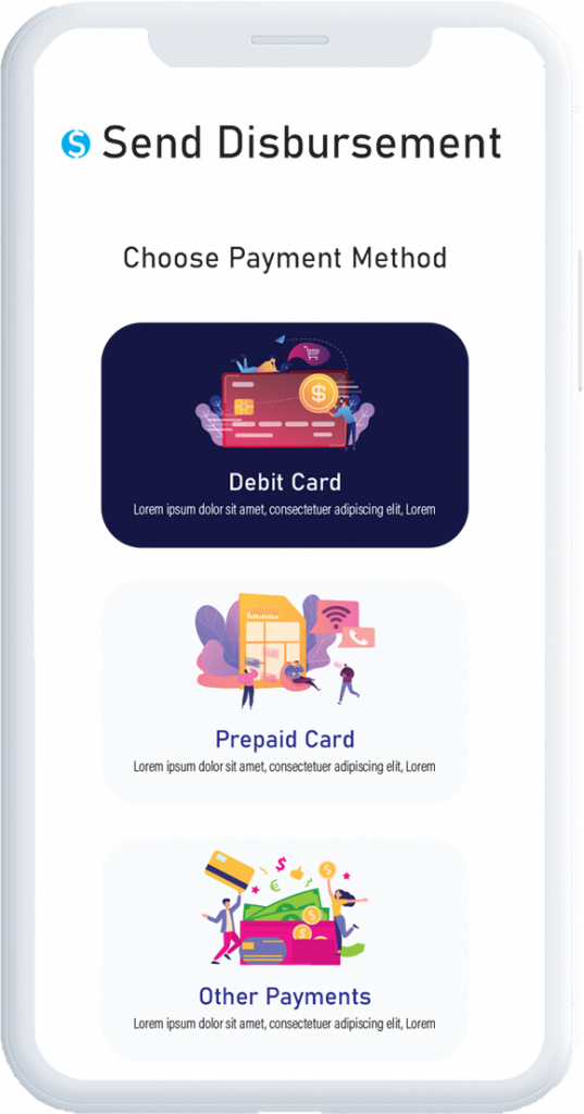
A full mobile app redesign incorporating custom illustrations that communicate APT's environmental commitment and seamless payment experience.
A Canada-themed card series designed for APT's physical and digital payment cards — bold identity, clean typography, national pride.
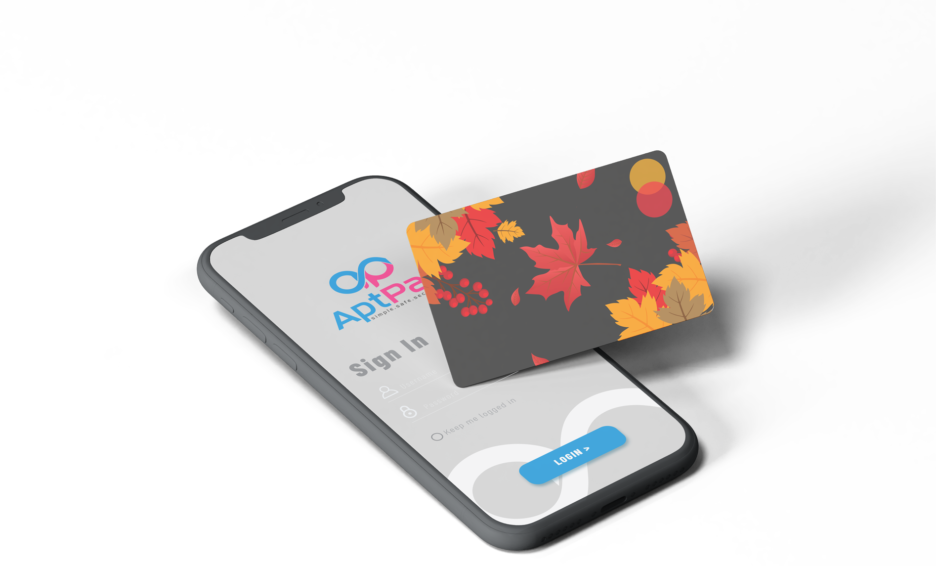
Dark-themed advertisement series centered on "Simple, safe, and secure" — aligned with APT's brand voice and distributed across digital and print channels.
Every feature emerged from research. Every interaction was pressure-tested against real workflows.
Auto-pay setup takes 60 seconds. ACH, credit card, and e-transfer — all supported. Payment status visible in real-time with push notifications for every state change.
Cash flow, collection rates, outstanding balances, and trends — updated live. No more month-end surprises.
E-signature with full audit trail. Residents sign leases on any device in minutes — not days.
Contextual alerts for payment due dates, maintenance updates, lease renewals — without the noise.
FINTRAC, PCI-DSS, and SOC 2 compliant. Disclosures integrated naturally — never blocking the flow.
Manage hundreds of units across multiple properties from a single dashboard. Role-based access for your entire team — managers, accountants, maintenance staff.
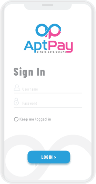
Residents manage everything from their phone — payments, maintenance requests, documents, and communication. Native feel, zero friction.
Outcomes measured 6 months post-launch against pre-redesign baseline.
"The new resident portal transformed our relationship with tenants. Payments are on time, support tickets dropped dramatically, and we actually get compliments on the software now — which has never happened before."
"I used to dread paying rent online — something always went wrong or I wasn't sure if it went through. The new app makes it obvious, instant, and actually kind of satisfying. I pay three days early now."
Financial products demand a different design posture. When real money is moving, every ambiguous confirmation state, every misleading label, every slow loading screen erodes the trust you need to convert and retain users.
The most impactful changes weren't the big redesigns — they were micro-moments: the animation on a successful payment, the clarity of an error message, the speed of a page transition. Those compound into an experience that feels effortless.
Explore more of my work across fintech, proptech, and SaaS product design.