- Canva Design • Canva Design•
- Canva Design • Canva Design•
- Canva Design • Canva Design•
- Canva Design • Canva Design•
- Canva Design • Canva Design•
- Canva Design • Canva Design•
- Canva Design • Canva Design•
- Canva Design • Canva Design•


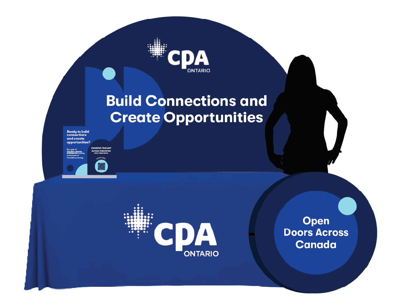
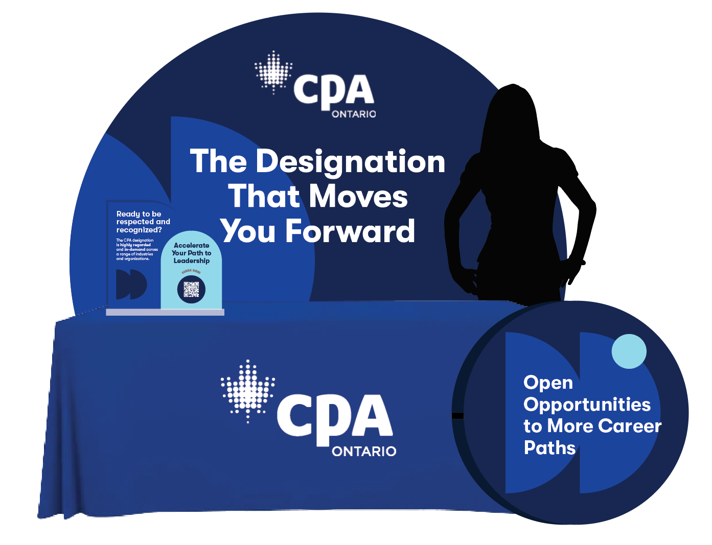
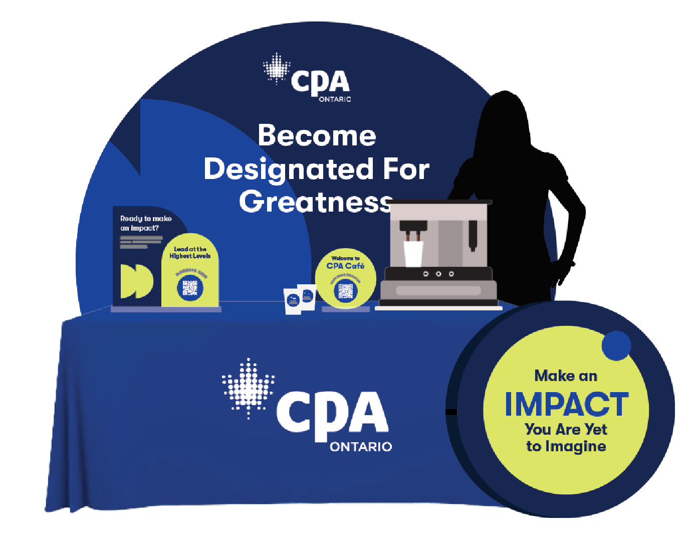
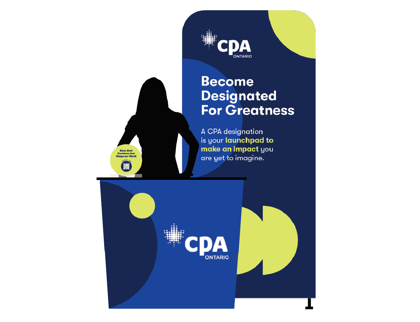
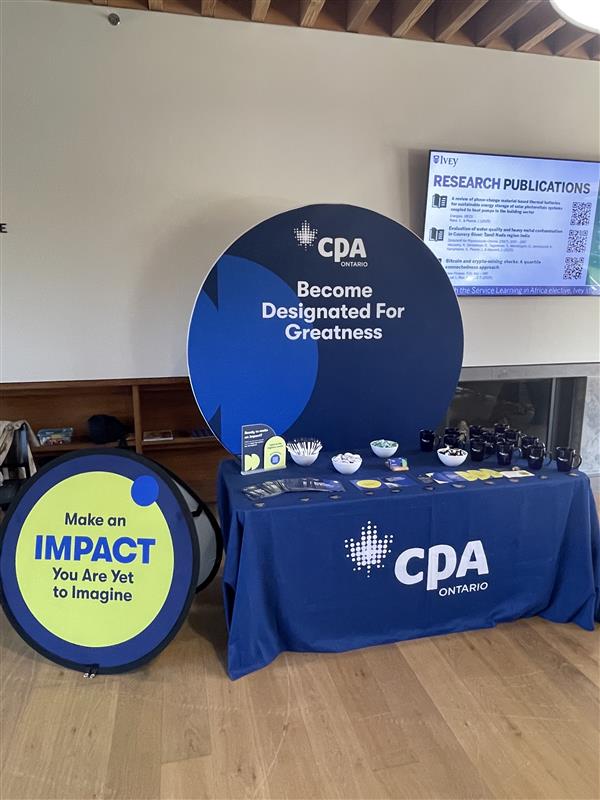
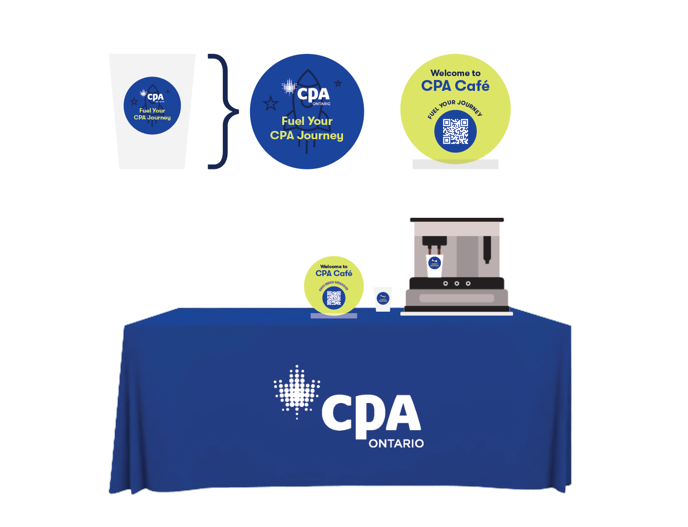
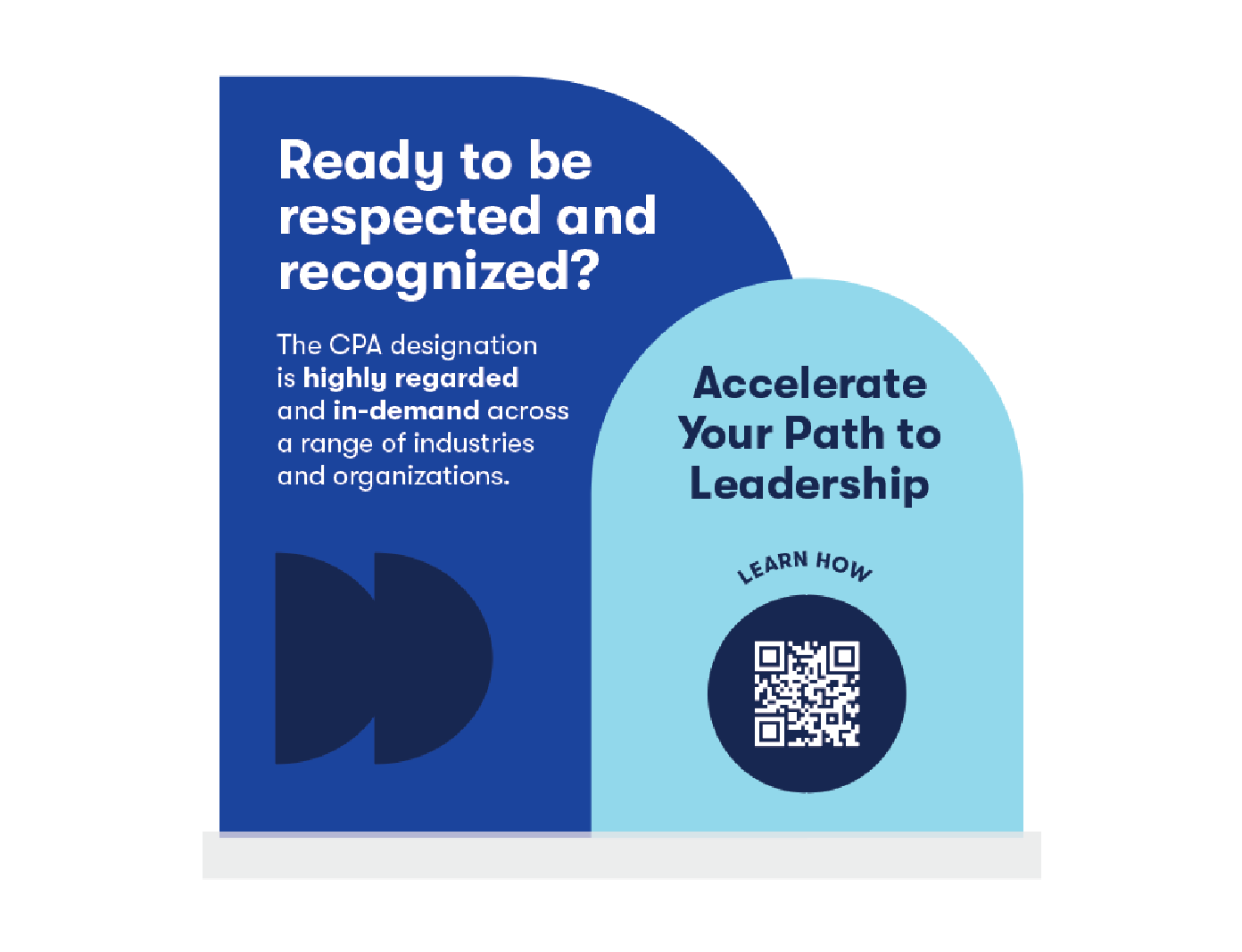
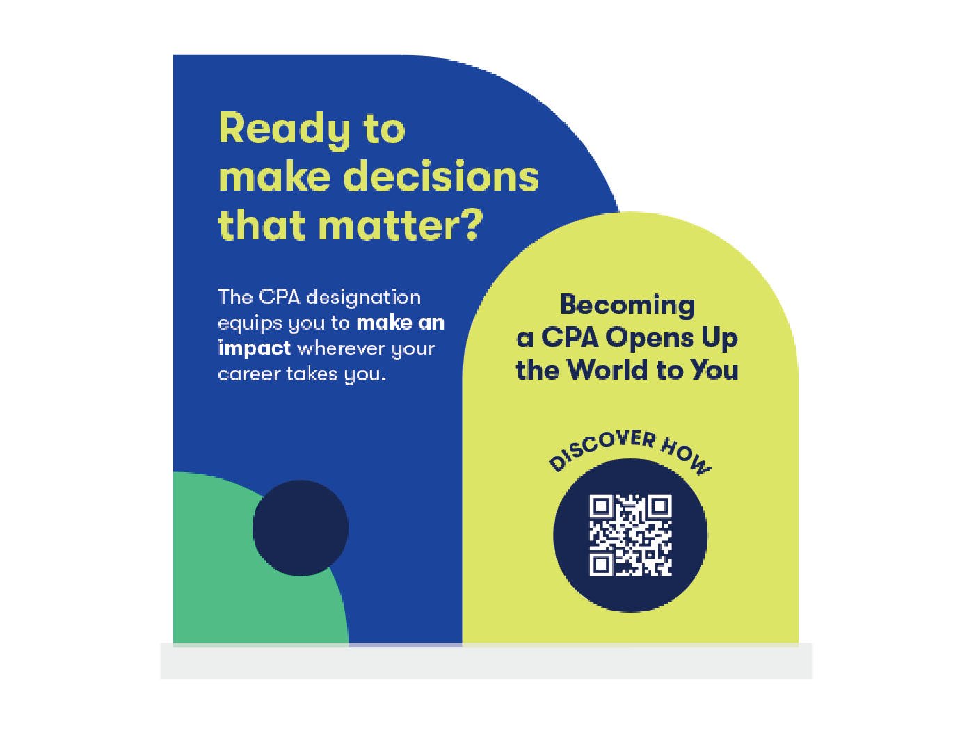
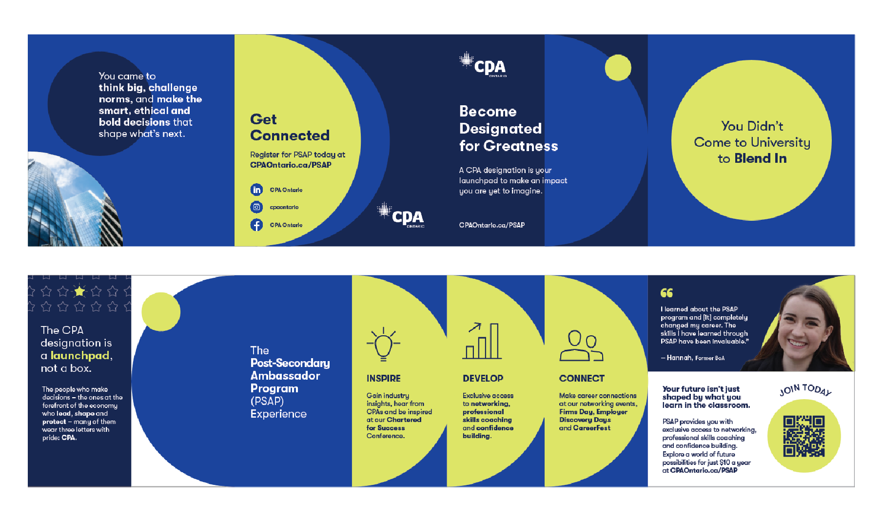
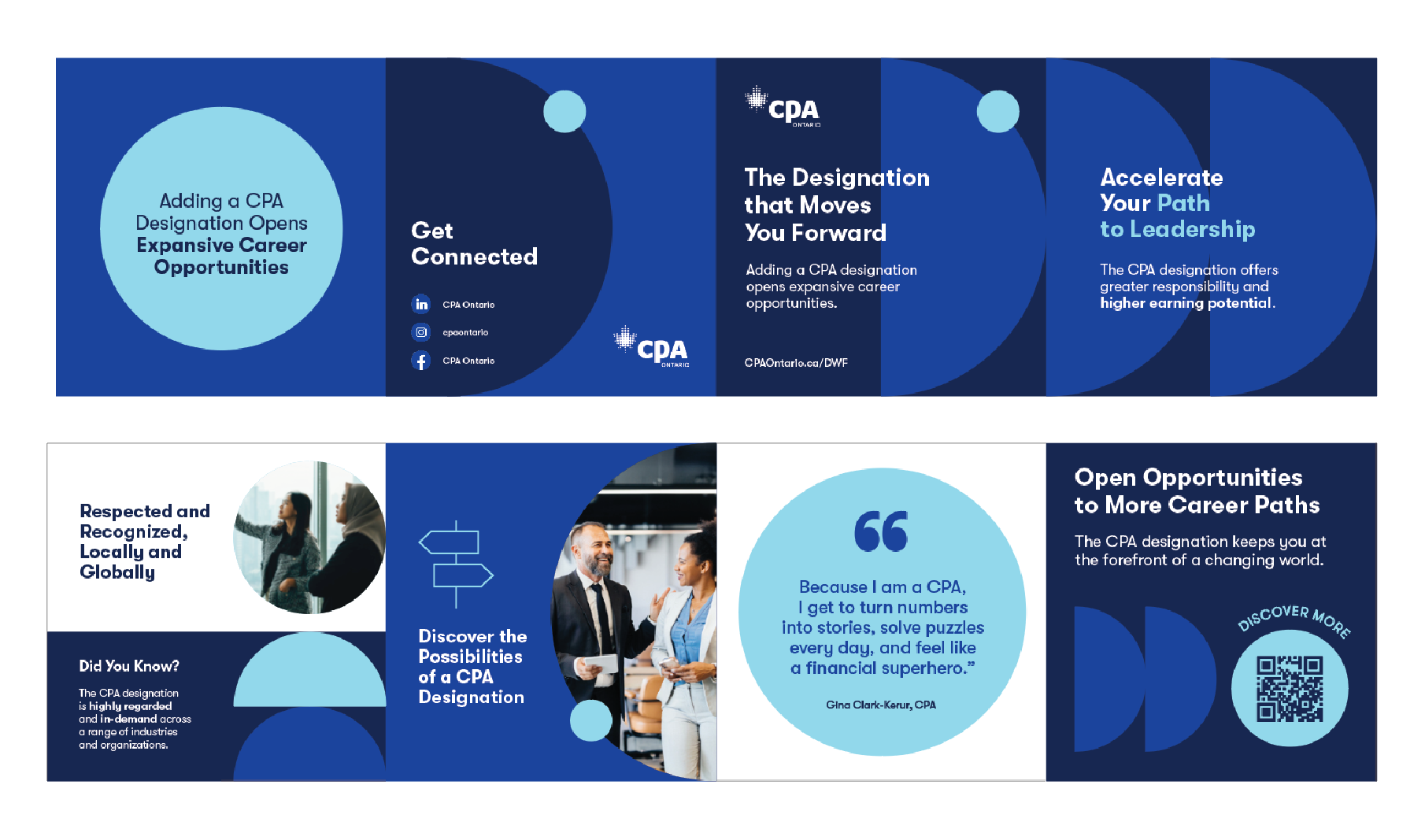
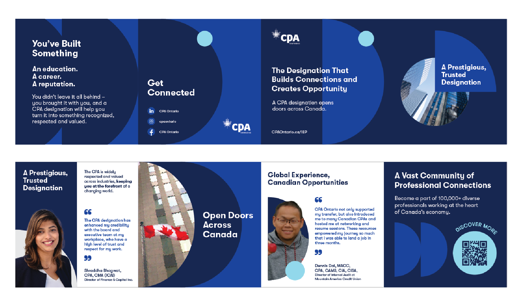
Recruitment Booth Design
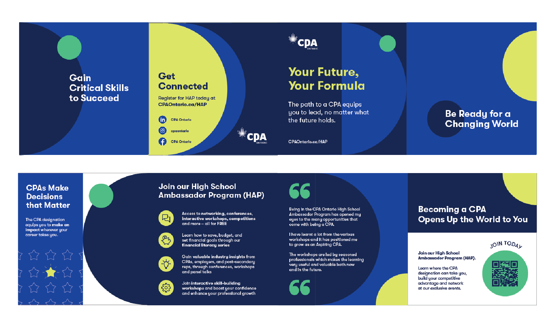
I designed printed brochures sized twenty four inches wide by six inches tall, folded and trimmed for handout use. These brochures delivered the main messaging for each audience group and helped visitors take away key information after speaking with the recruitment team. I created them to be clear, easy to read, and visually consistent with the booth, supporting deeper conversations and giving potential members a branded piece to take home and review later.
KPI Targets Solution
Through thoughtful design, I helped strengthen CPA Ontario’s professional image and improved the clarity and engagement of communications. The materials support CPA Ontario’s mission to uphold high standards, foster public trust, and communicate effectively with members, stakeholders, and the public.


KPI Revenue Solution
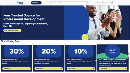
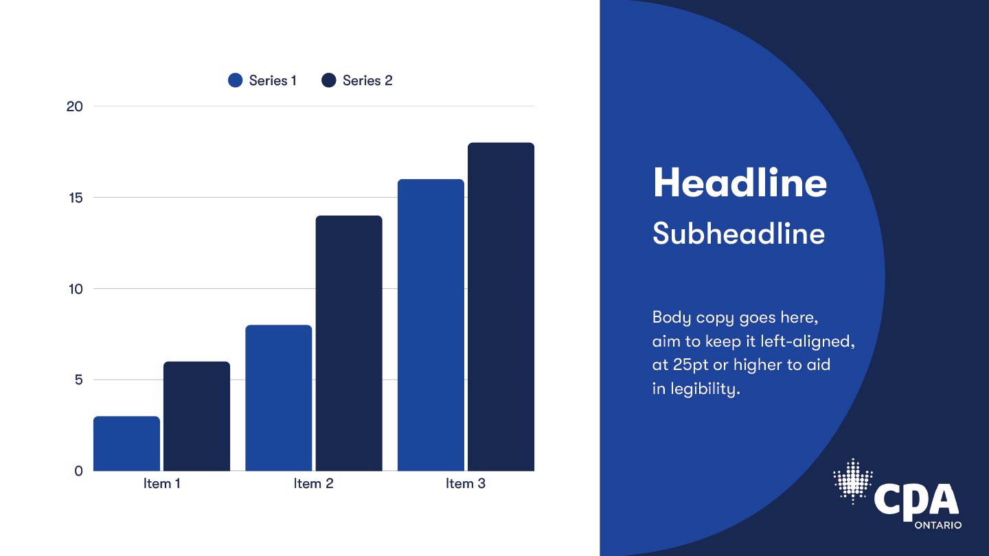
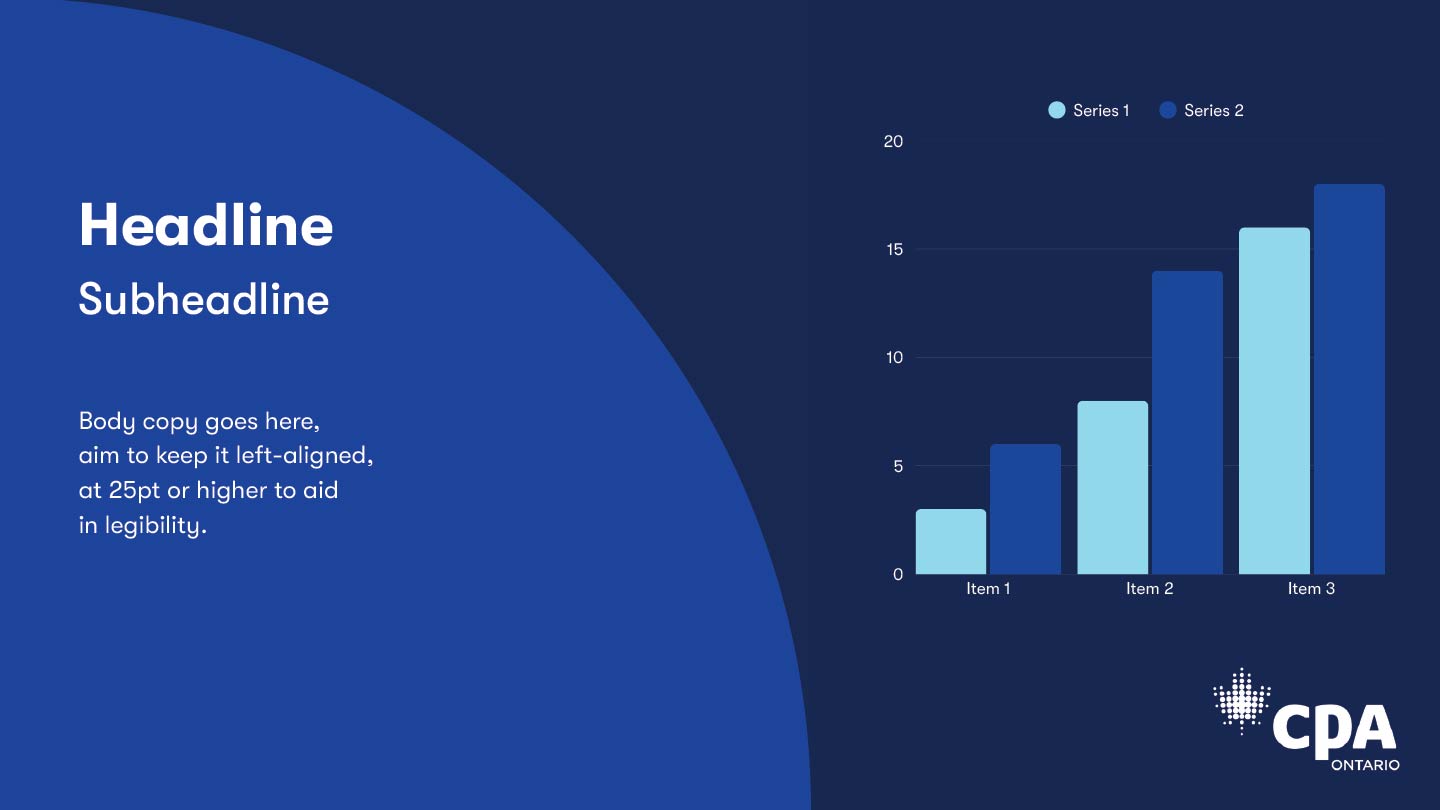
abandoned items in their cart. The key KPIs focused on improving email open rates to 46.2 percent, increasing click through rates to 6.5 percent, boosting social media engagement across all platforms, reducing cost per click on paid ads, and increasing course registrations. The revenue target for the campaign was 460,000 dollars in total sales with a goal of achieving 30 percent year over year growth. Black Friday and Cyber Monday sales in 2025 generated 286,254 dollars, which represented a 6 percent increase in revenue compared to the previous year. The goal for the latest campaign cycle was to surpass this performance and reach the projected revenue target.


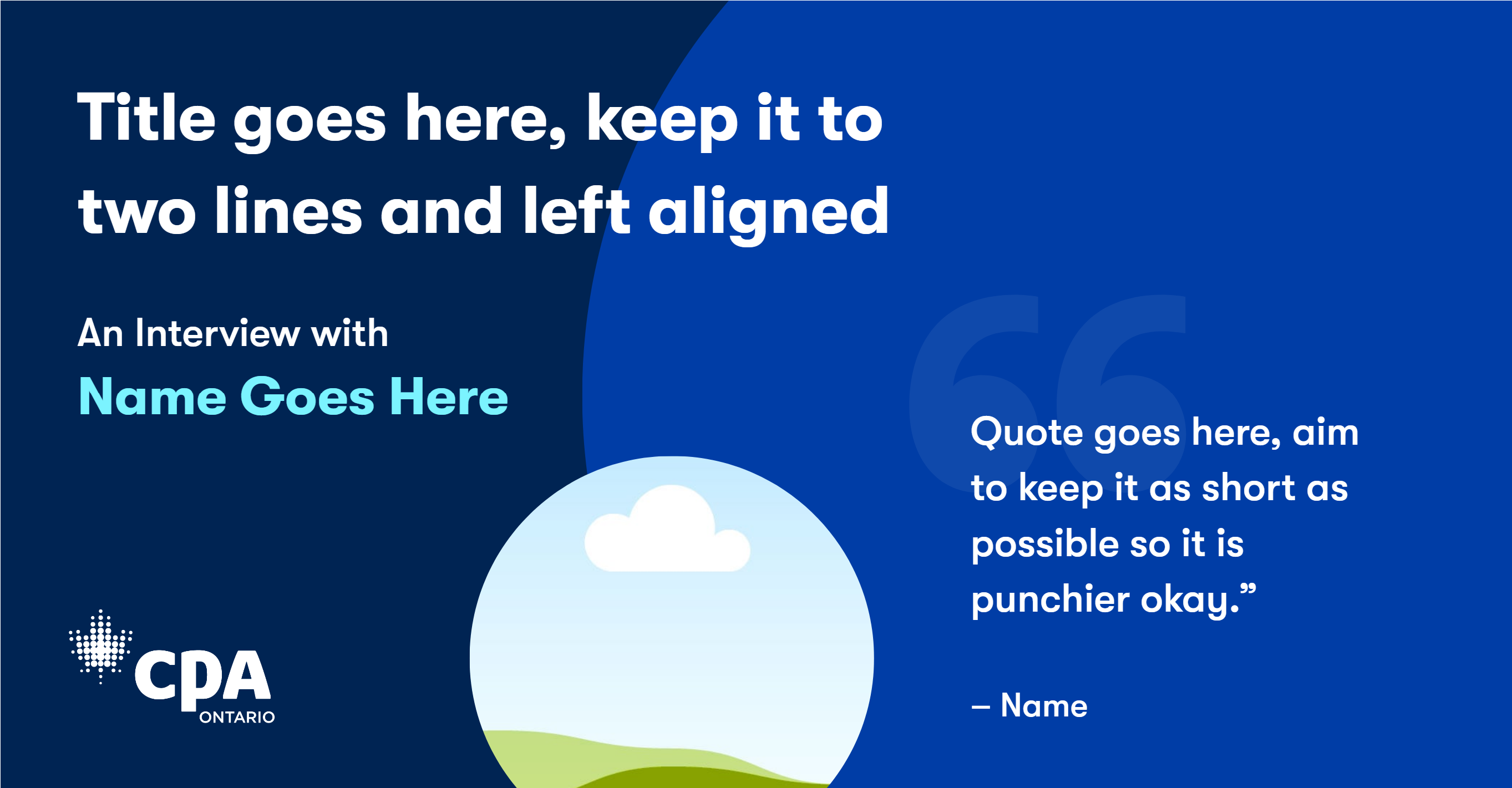
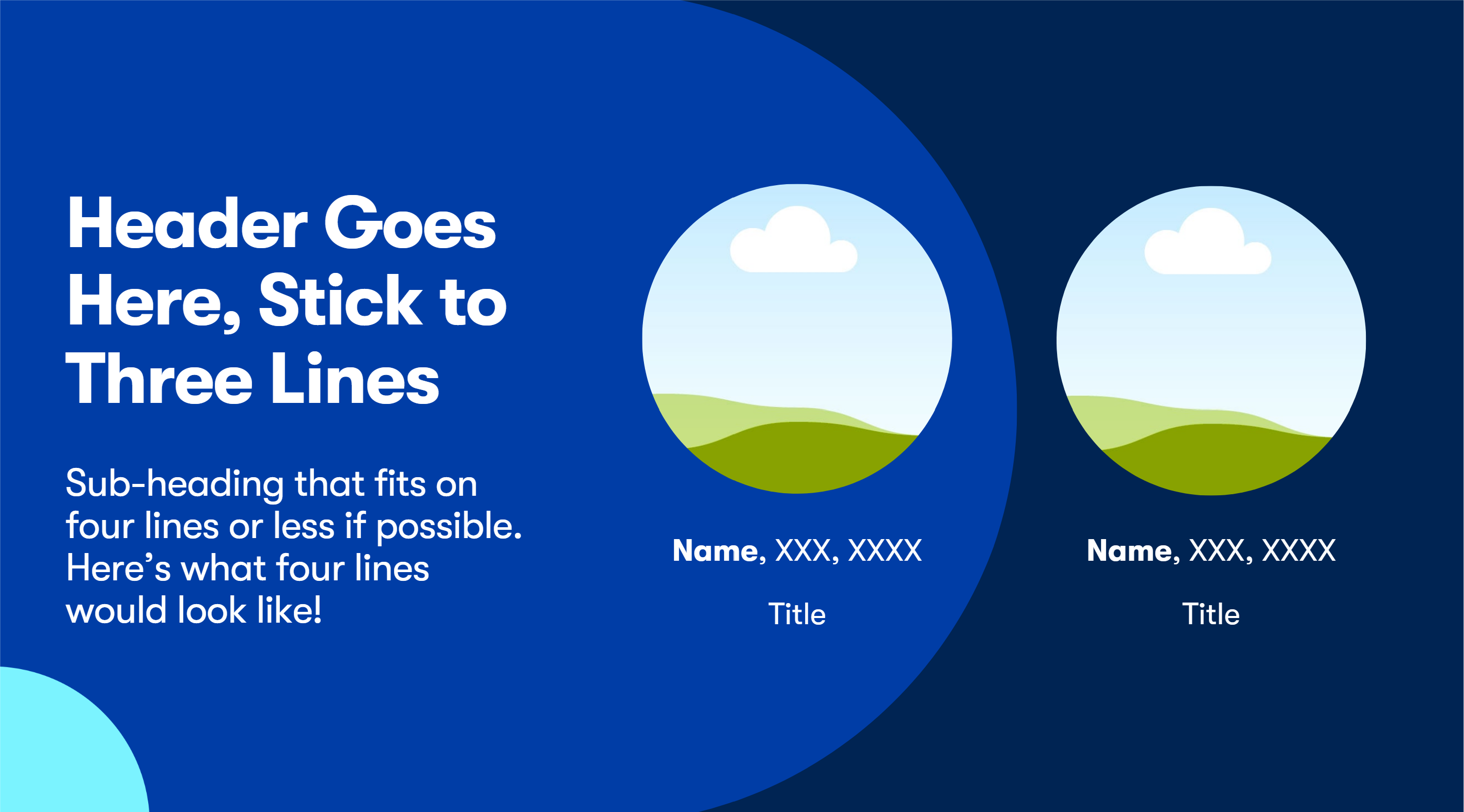
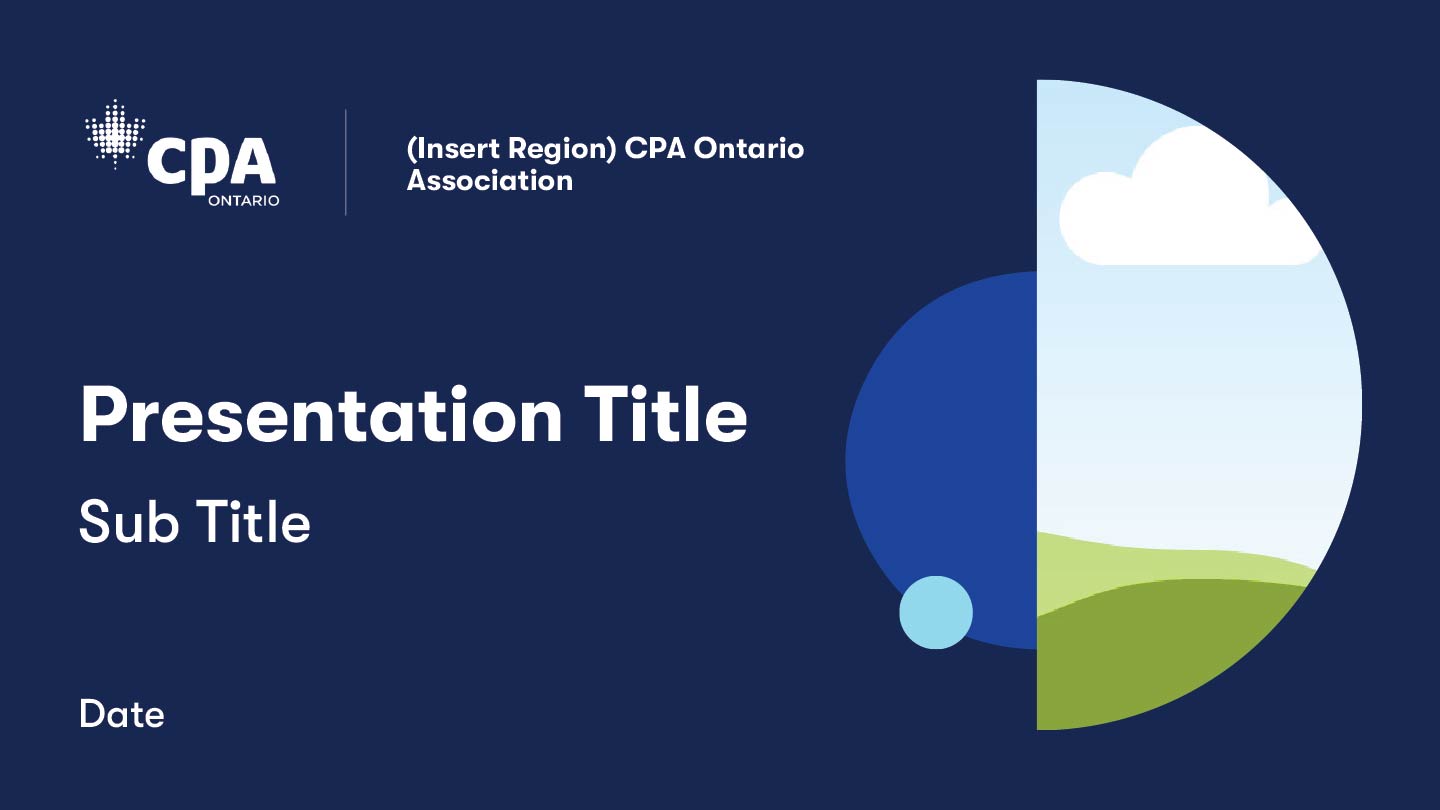
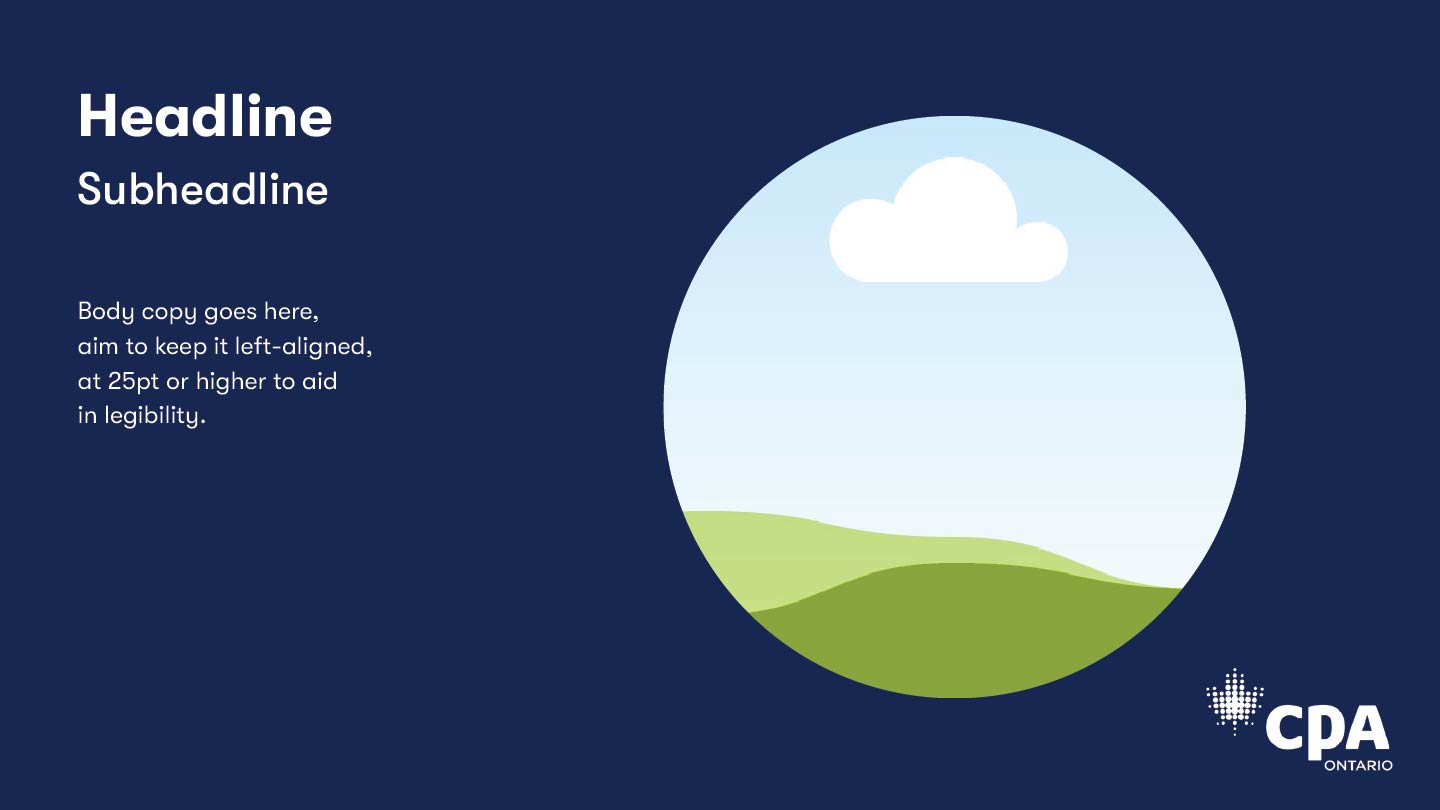
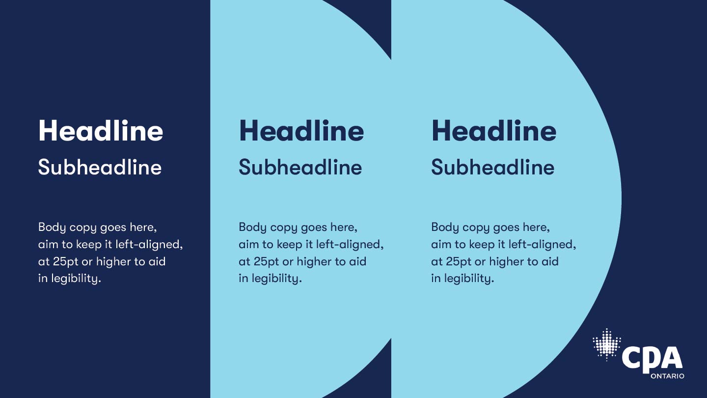
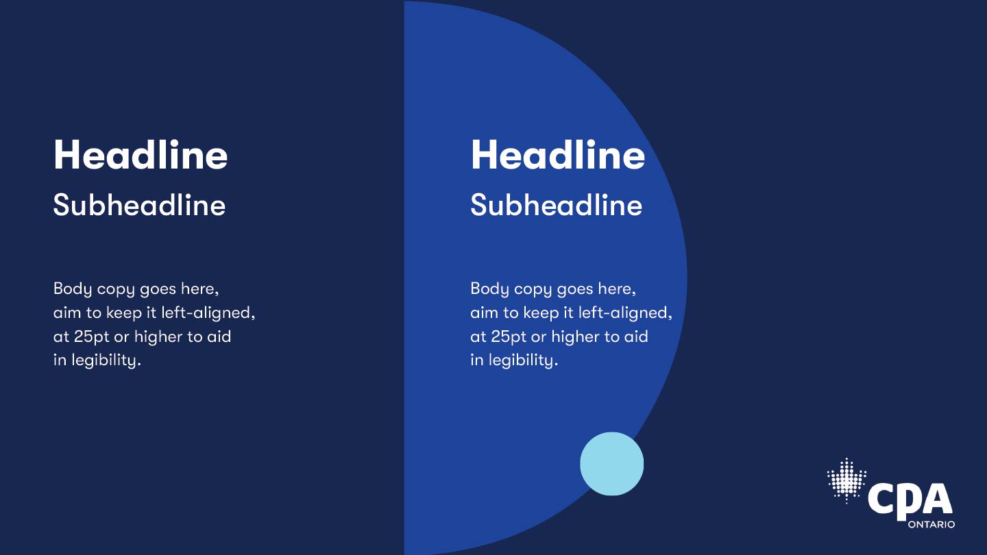
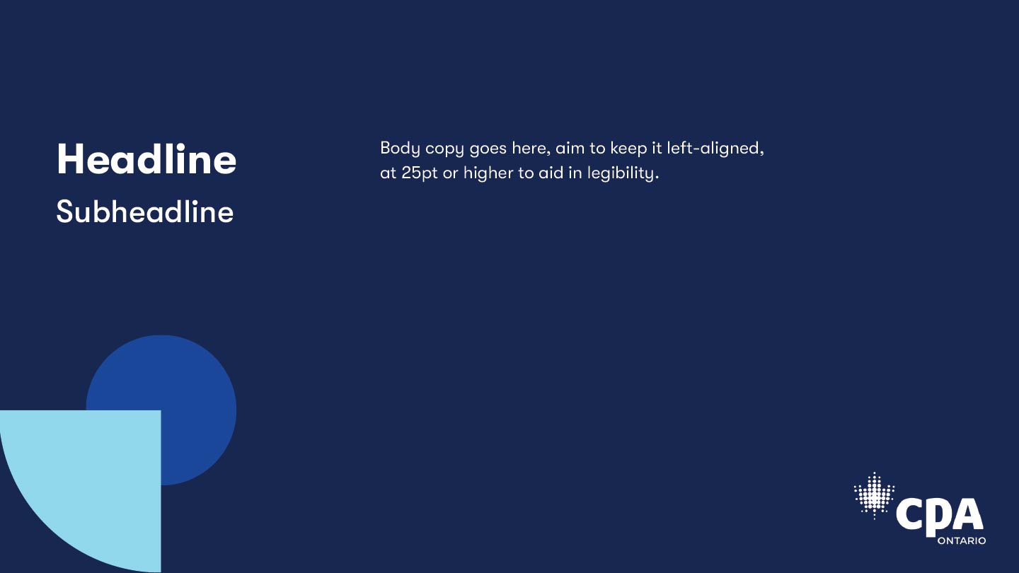
Power Point Design
Through thoughtful design, I helped strengthen CPA Ontario’s professional image and improved the clarity and engagement of communications. The materials support CPA Ontario’s mission to uphold high standards, foster public trust, and communicate effectively with members, stakeholders, and the public.


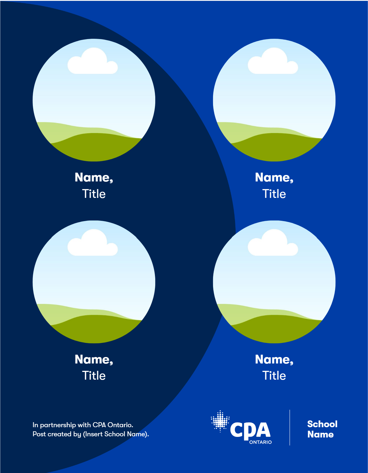
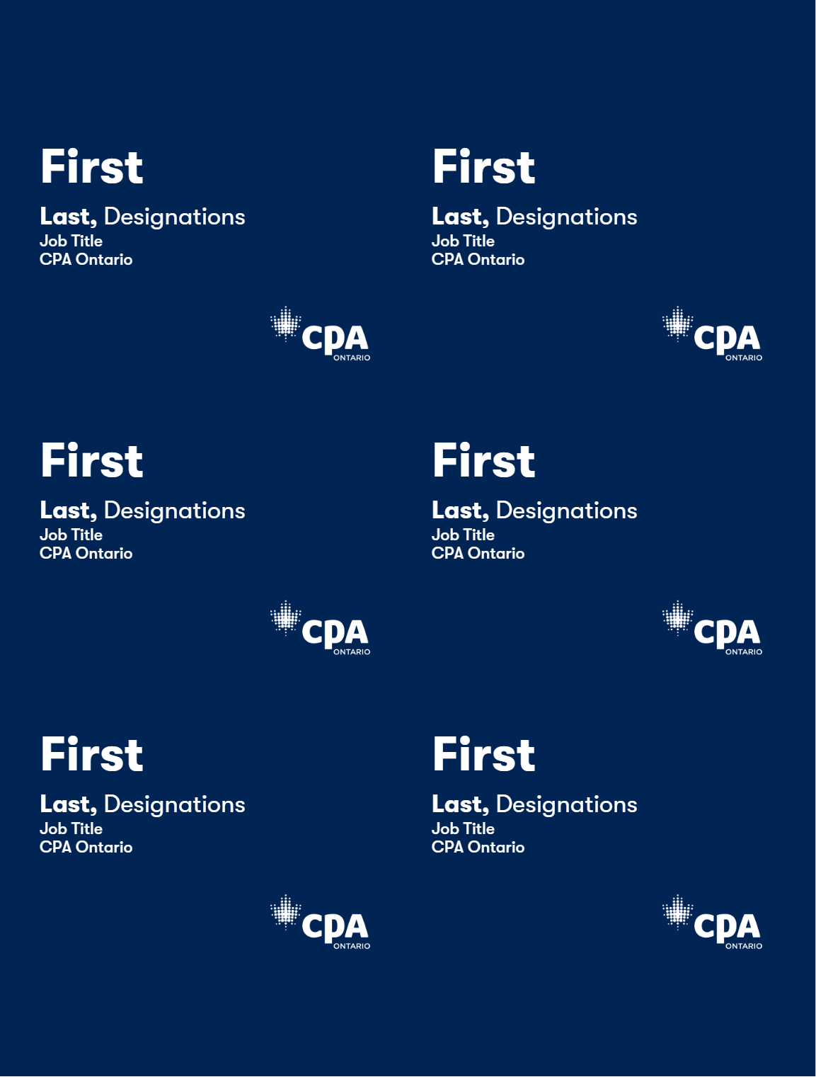
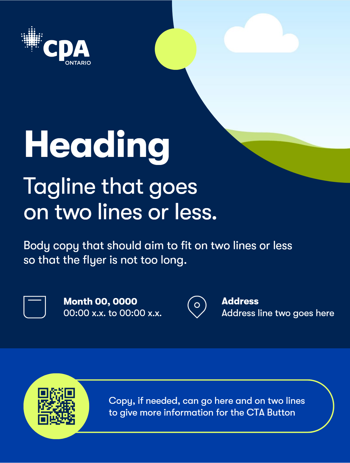
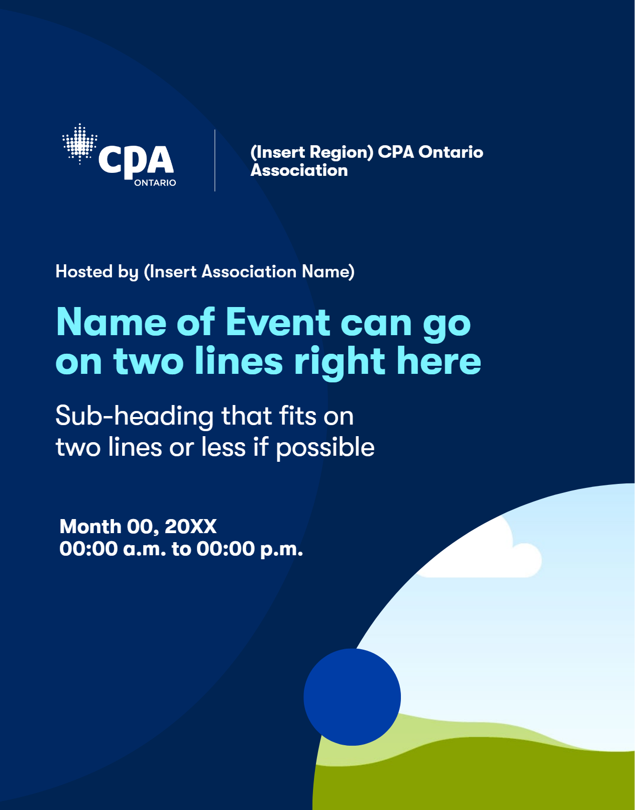
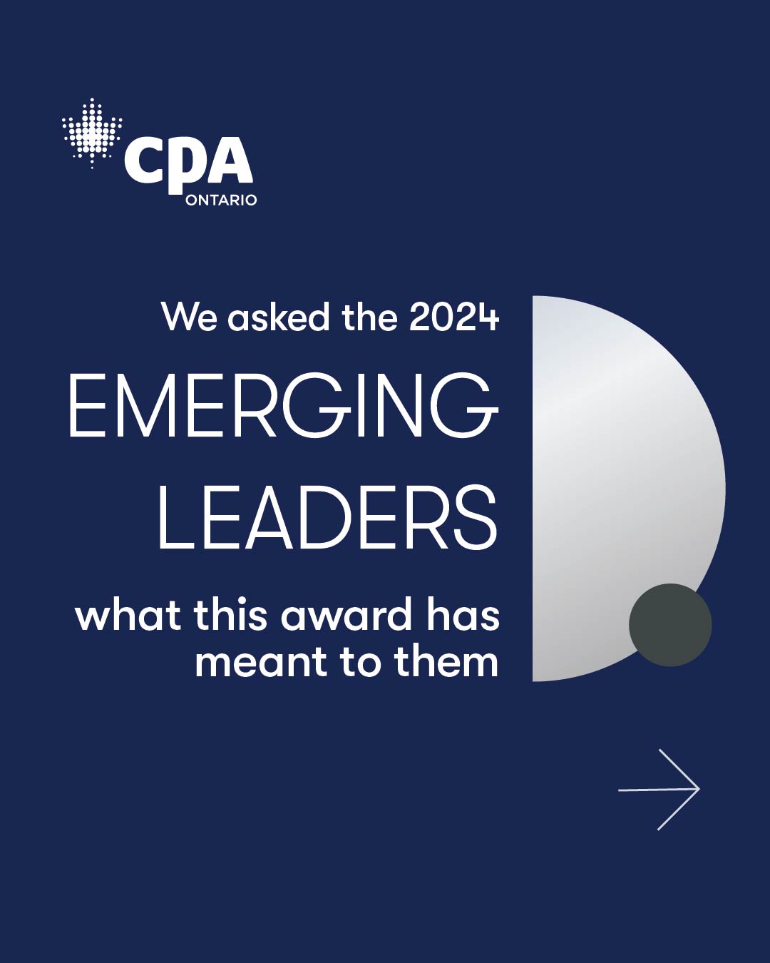
Canva Designs
I also built a set of Canva templates that allowed the marketing team to produce faster design variations for daily content needs. These templates were created with clear structure, approved by me, and consistently checked for accuracy to ensure they aligned with CPA Ontario brand standards.