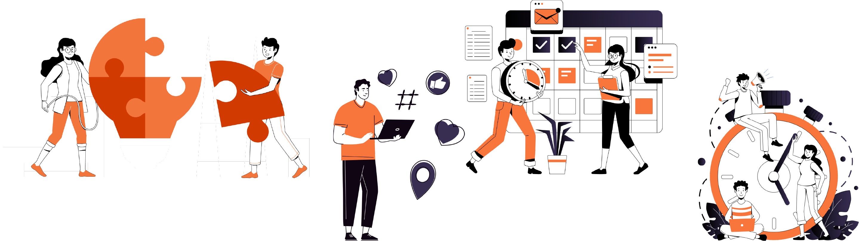
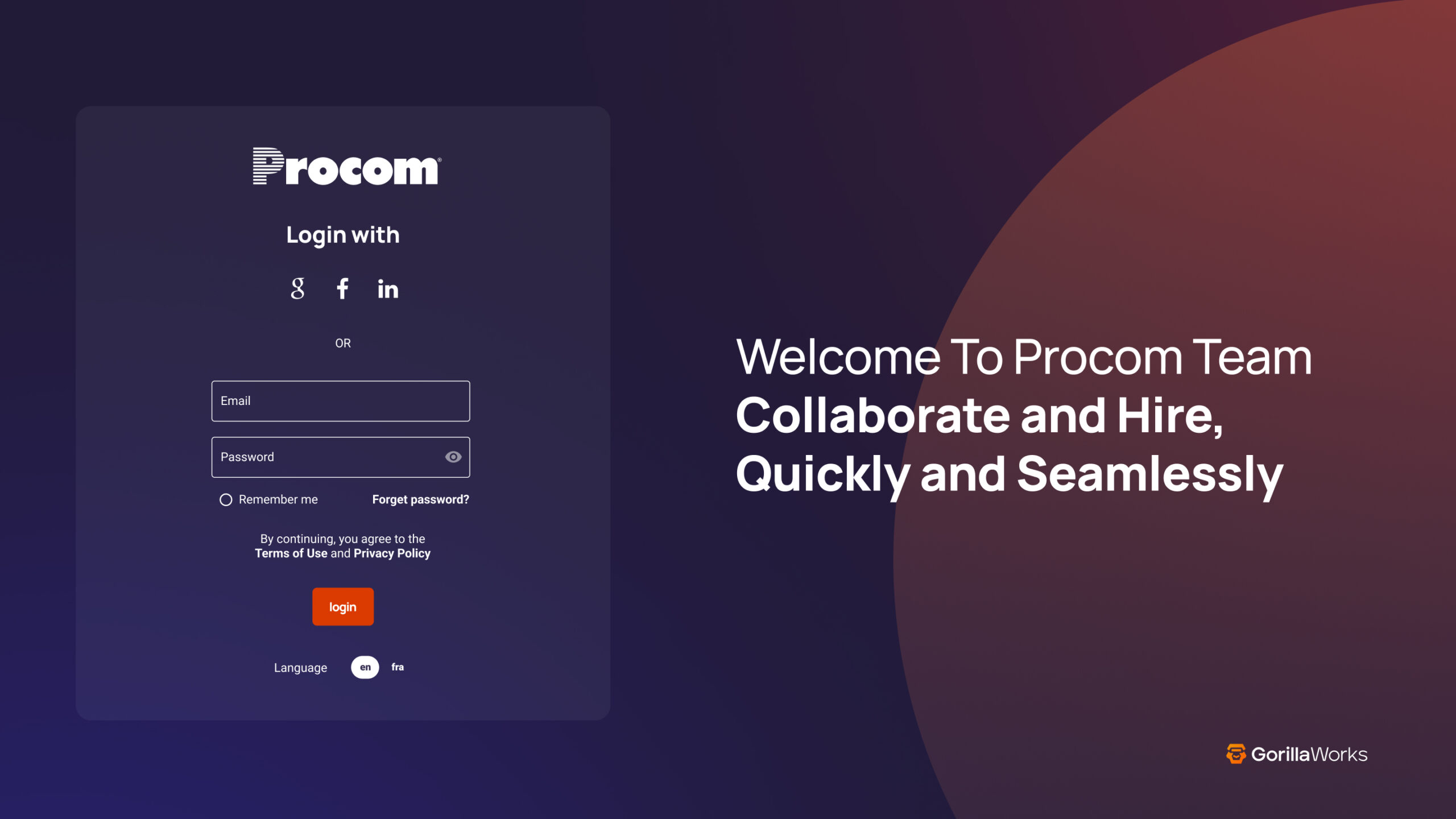
GorillaWorks is a tech platform that helps staffing agencies streamline back-office operations like payroll, compliance, and resume formatting. By automating admin tasks with smart, user-friendly tools, they enable agencies to focus on growth and client success.
The Challange:
GorillaWorks needed a clean, accessible user experience to streamline complex workflows for staffing agencies. Key goals included improving dashboard usability, optimizing email engagement, and ensuring AODA compliance across all design touchpoints.
My Role:
I designed wireframes, user flows, and mockups using Figma and Adobe XD to support GorillaWorks’ platform and communication tools. I optimized email templates for accessibility and brand consistency, applying AODA standards that improved engagement across campaigns. I also helped develop layout systems for dashboards and mobile, contributing to a 28% increase in retention, and assisted in QA to ensure visual and accessibility standards were met.
The Design Breakdown
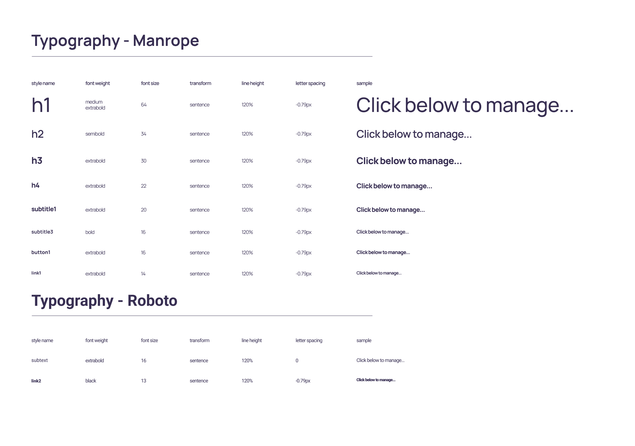
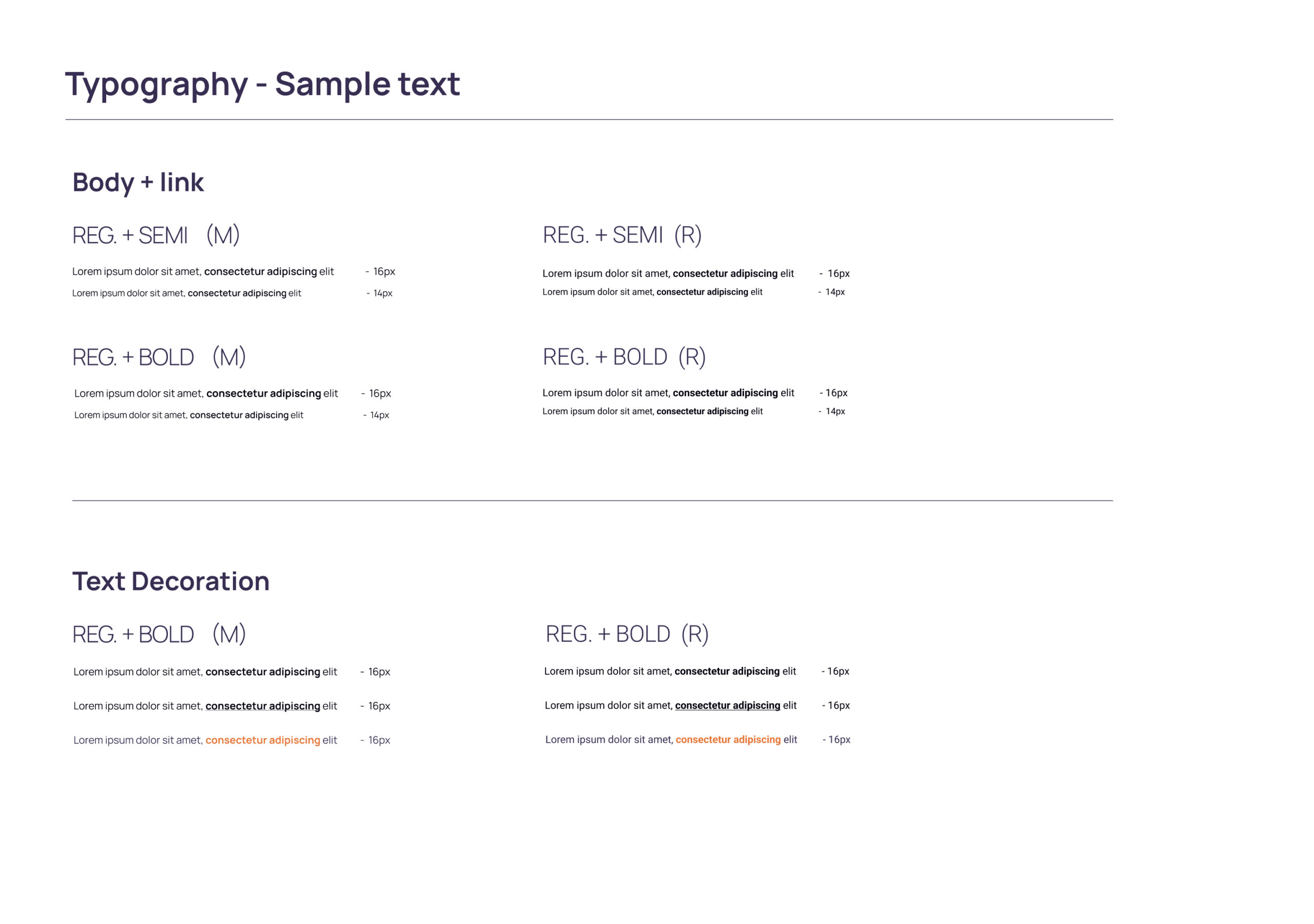
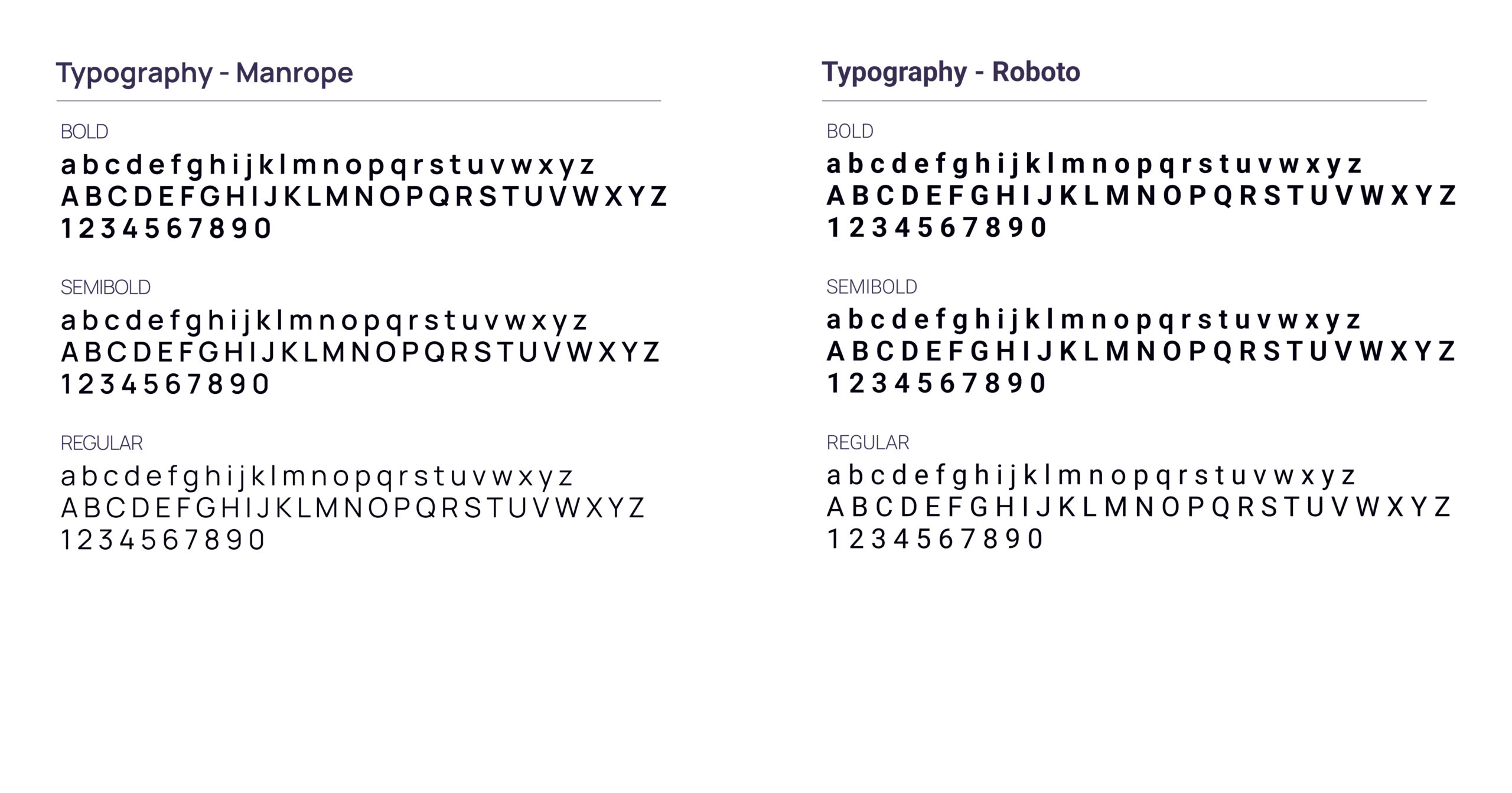
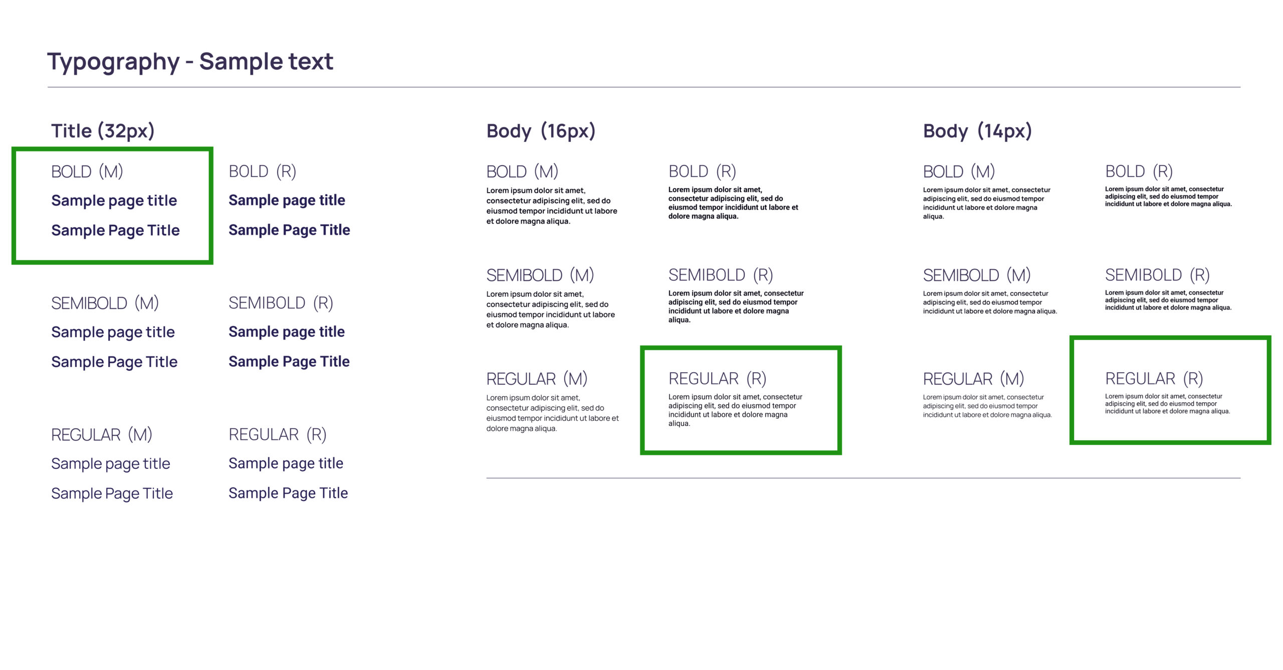
Fonts:
We chose Manrope as the primary typeface for its modern, clean, and highly legible design. Its geometric style and subtle friendliness helped create a professional yet approachable feel, aligning perfectly with GorillaWorks’ brand identity. Manrope also scales well across desktop and mobile interfaces, ensuring a consistent experience at every touchpoint.
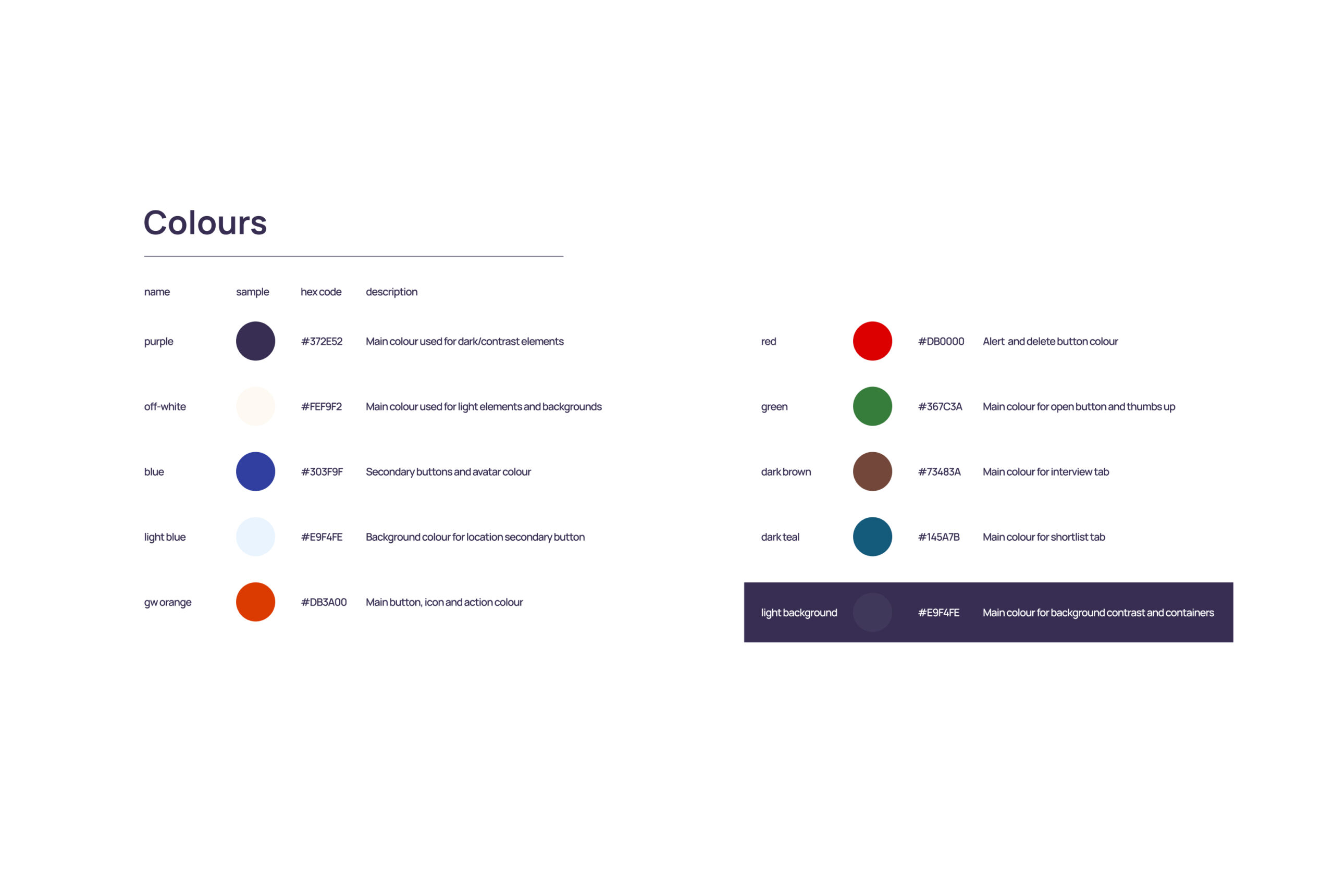
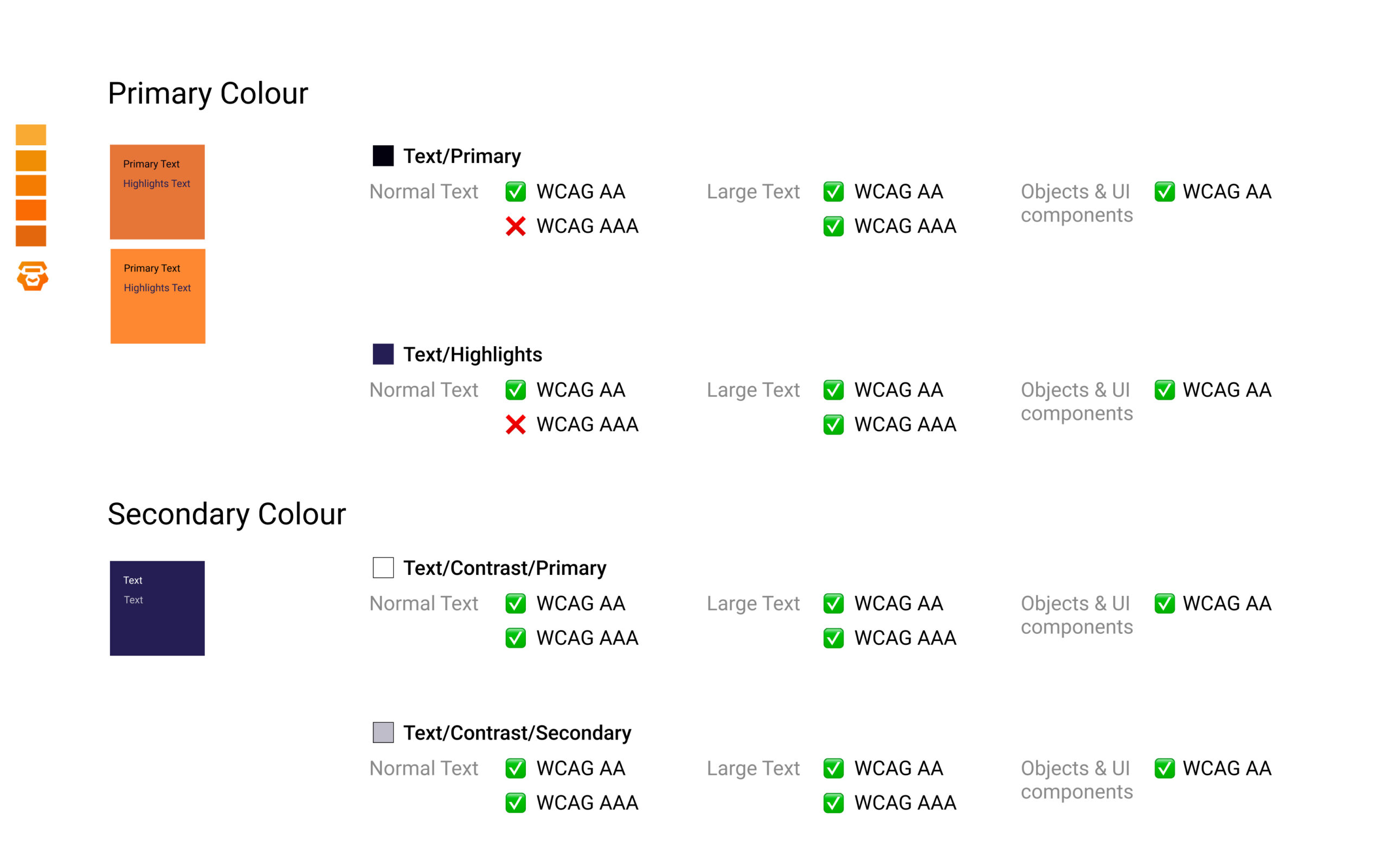
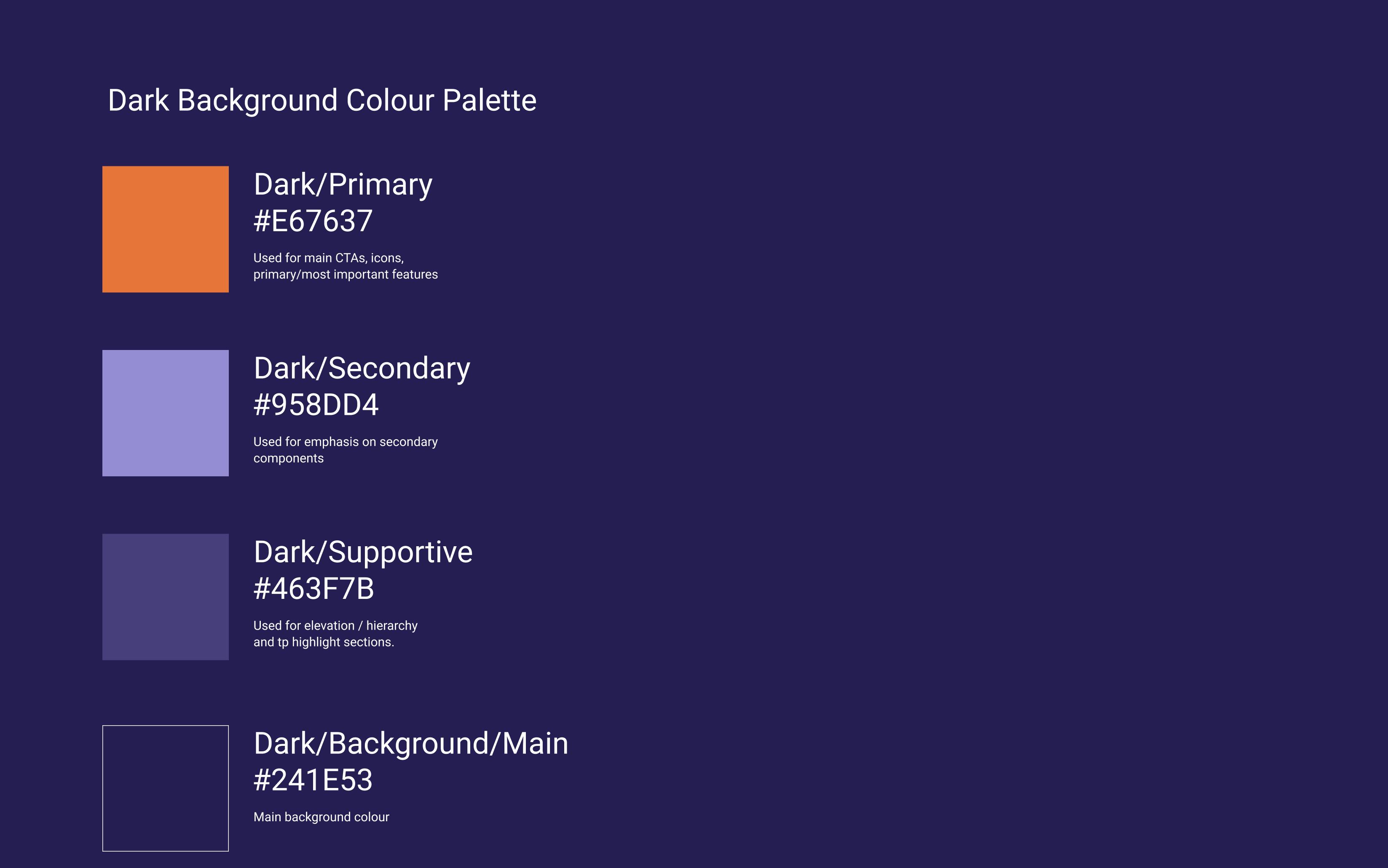
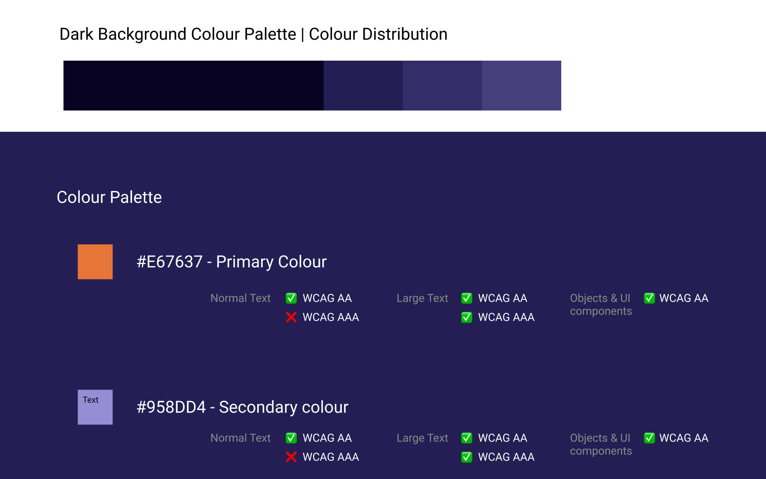
Color Palette
We selected a color palette that balances trust, innovation, and usability.
Primary colors focus on professional blues and rich neutrals, conveying reliability and efficiency.
Accent colors introduce softer, energetic tones to bring moments of warmth and approachability to the user journey. The palette was carefully crafted to meet accessibility standards while maintaining visual consistency across the website and program interfaces.
Iconography
We used a modern, minimal icon set to support clarity and intuitive navigation. Each icon was carefully selected to visually reinforce actions and concepts without overwhelming users. Consistent line weights, simple shapes, and clean strokes ensure that the icons integrate seamlessly with the overall design language, enhancing usability while maintaining a polished, professional look.
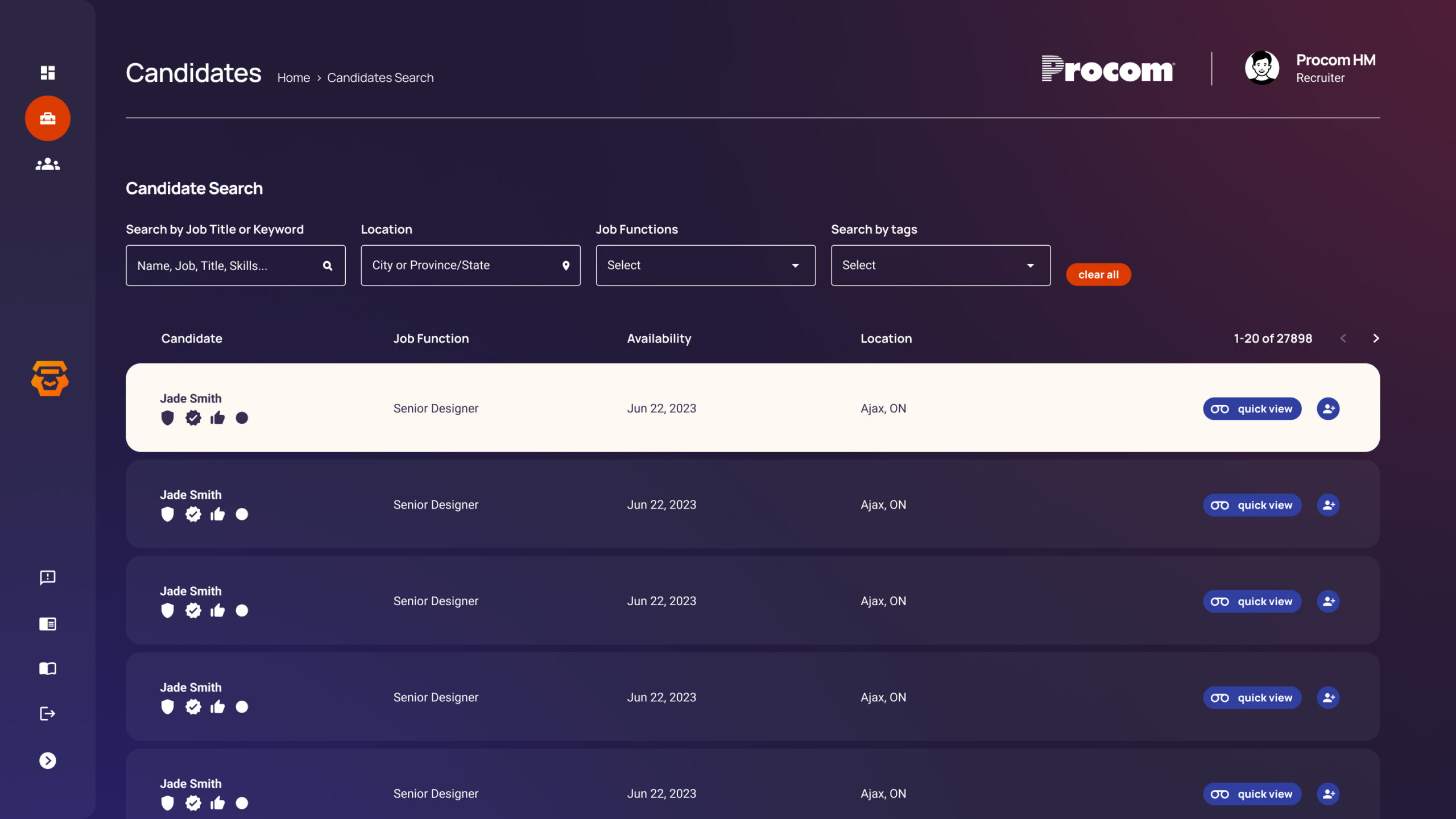
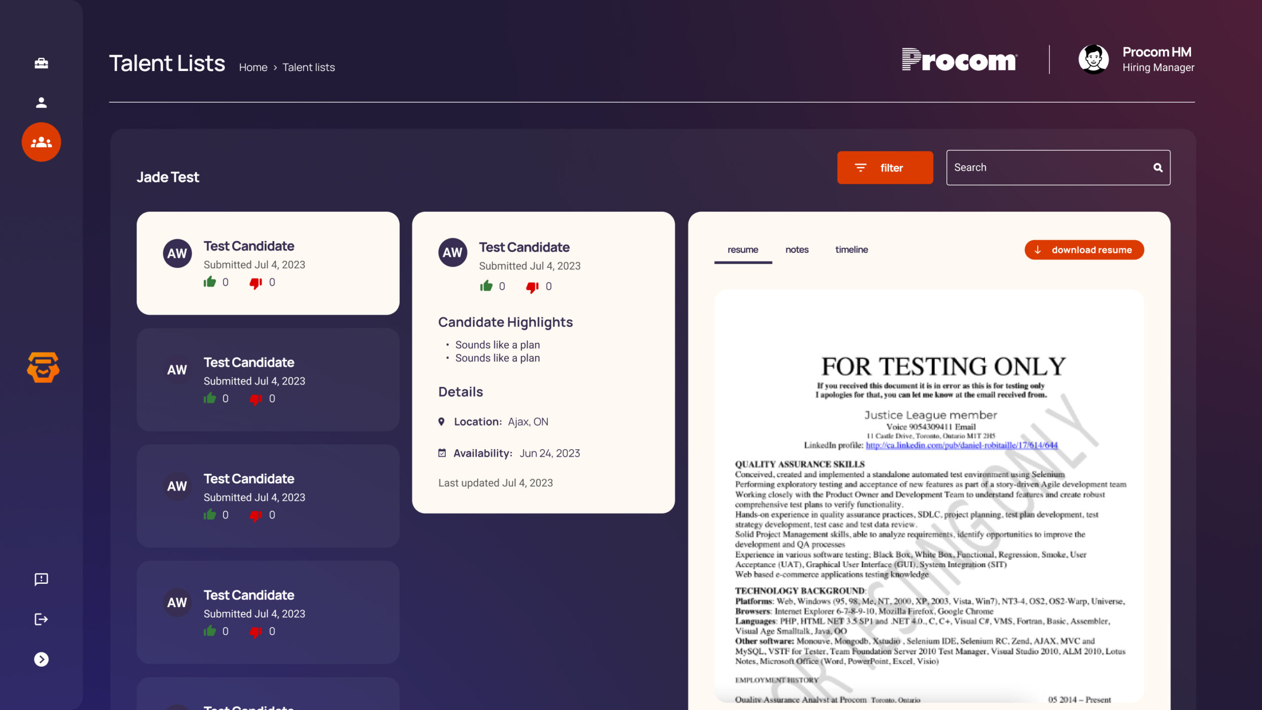
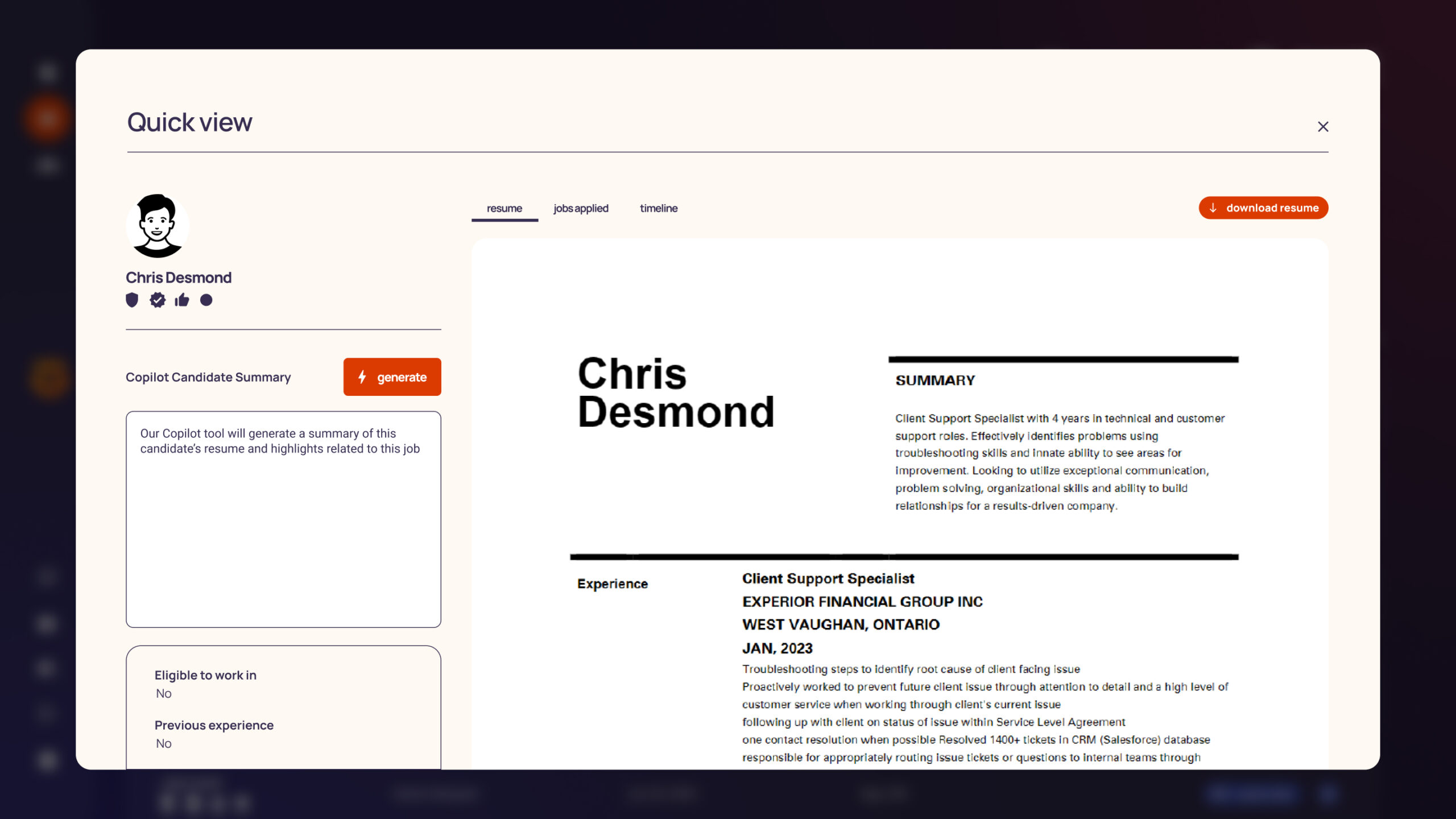
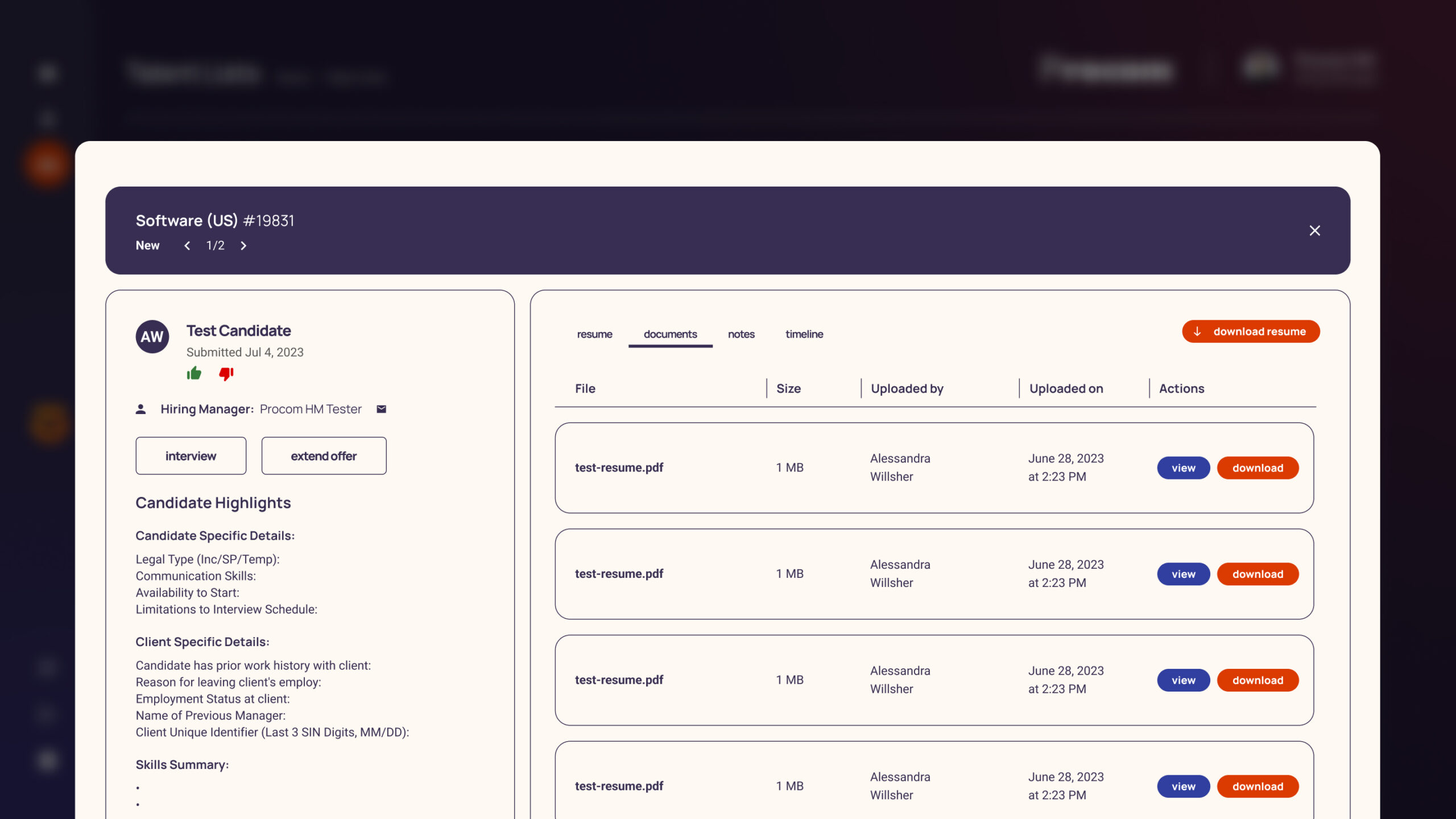
UI Components Overview
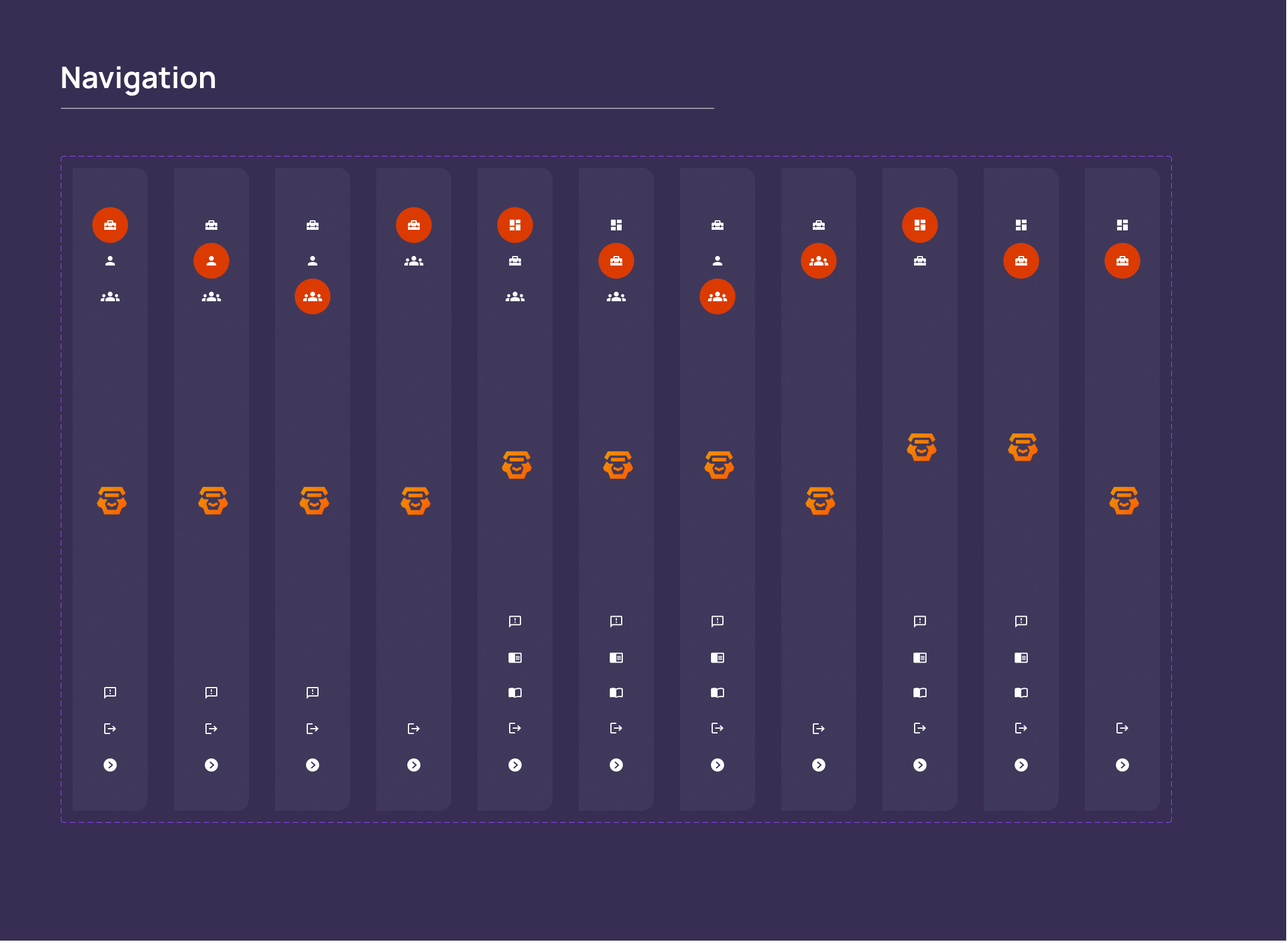
Navigation
Designed a clear and streamlined navigation system to ensure easy access to key features and smooth user journeys across the platform.
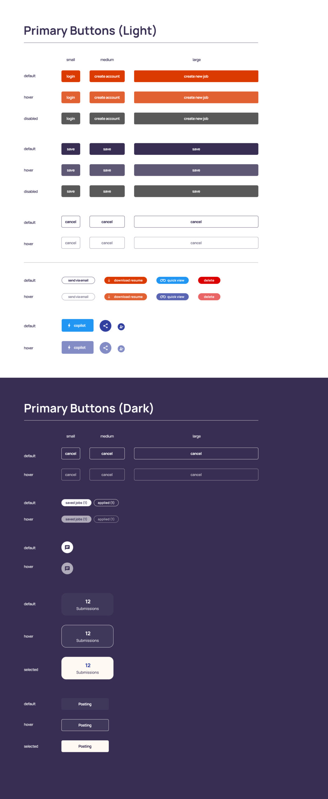
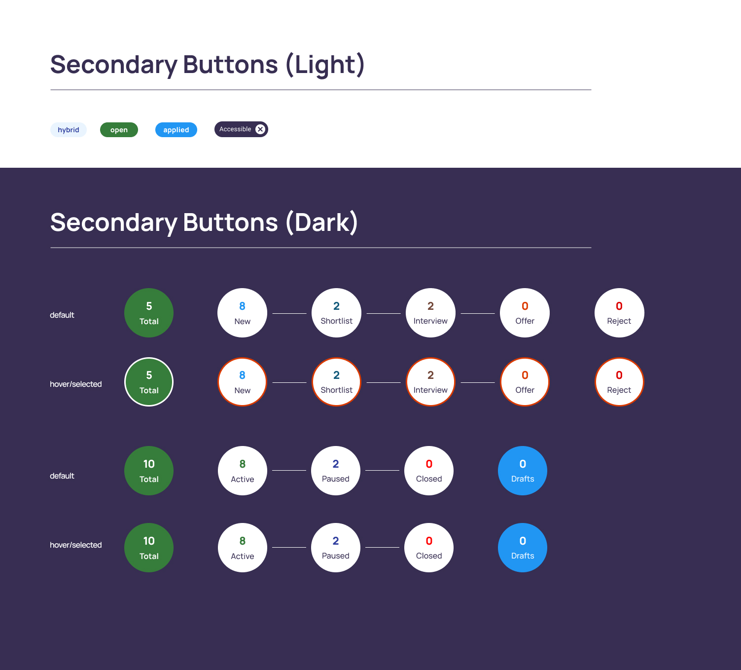
Primary & Secondary Buttons
Created visually distinct button styles to establish clear action hierarchies, with bold primary buttons and subtle secondary options for supporting actions.
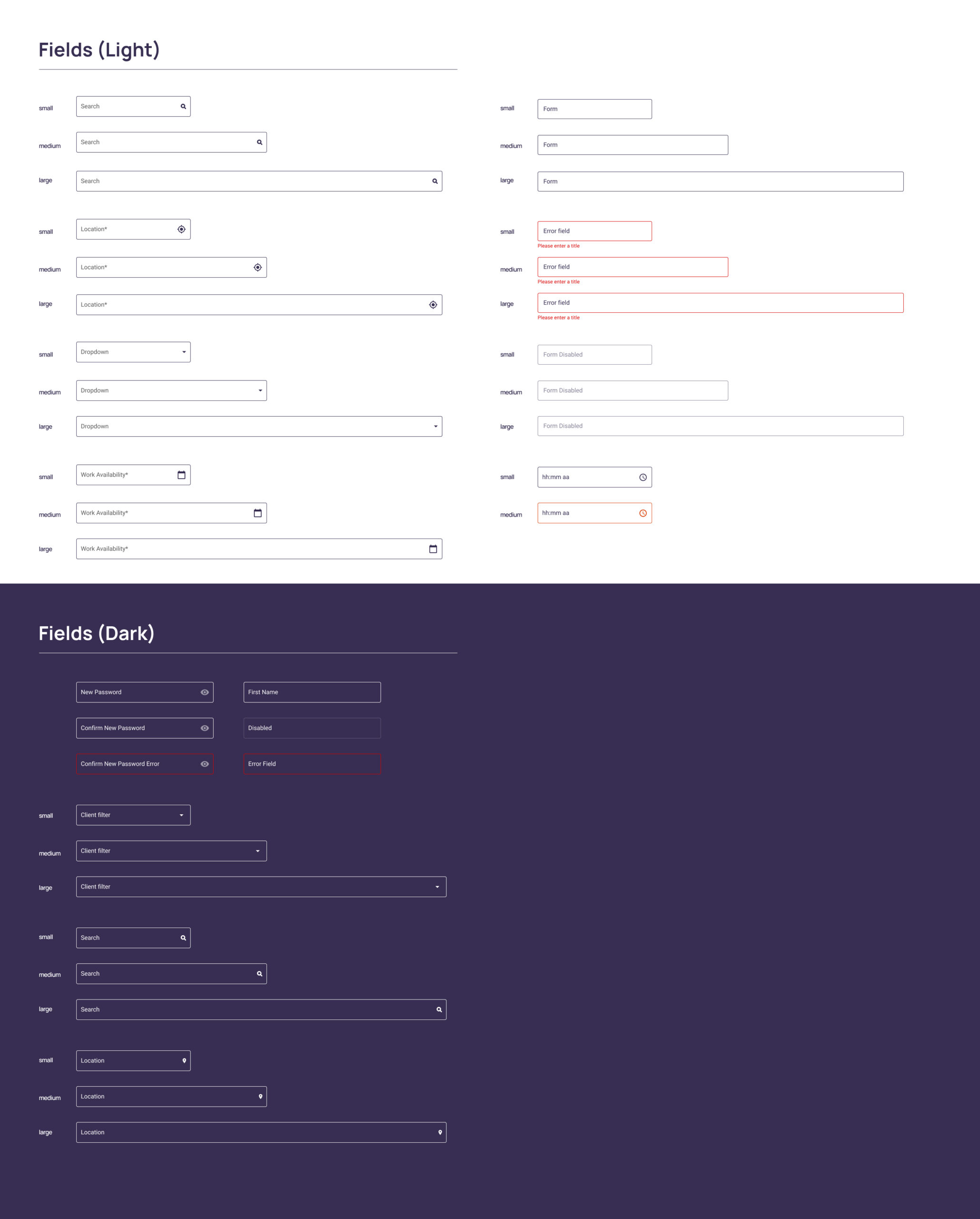
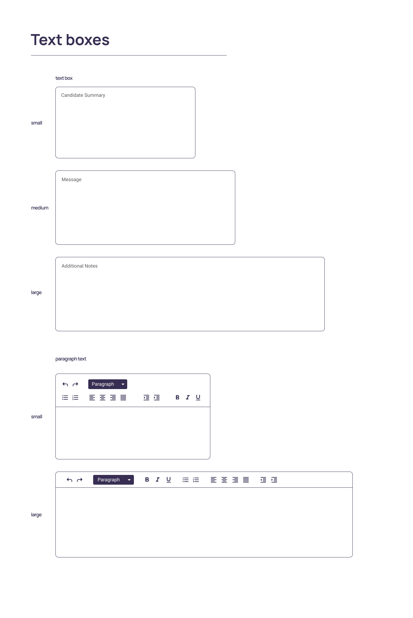
Fields & Textboxs
Developed simple, accessible fields and textboxes with strong labeling, ample padding, and high contrast for effortless data entry.
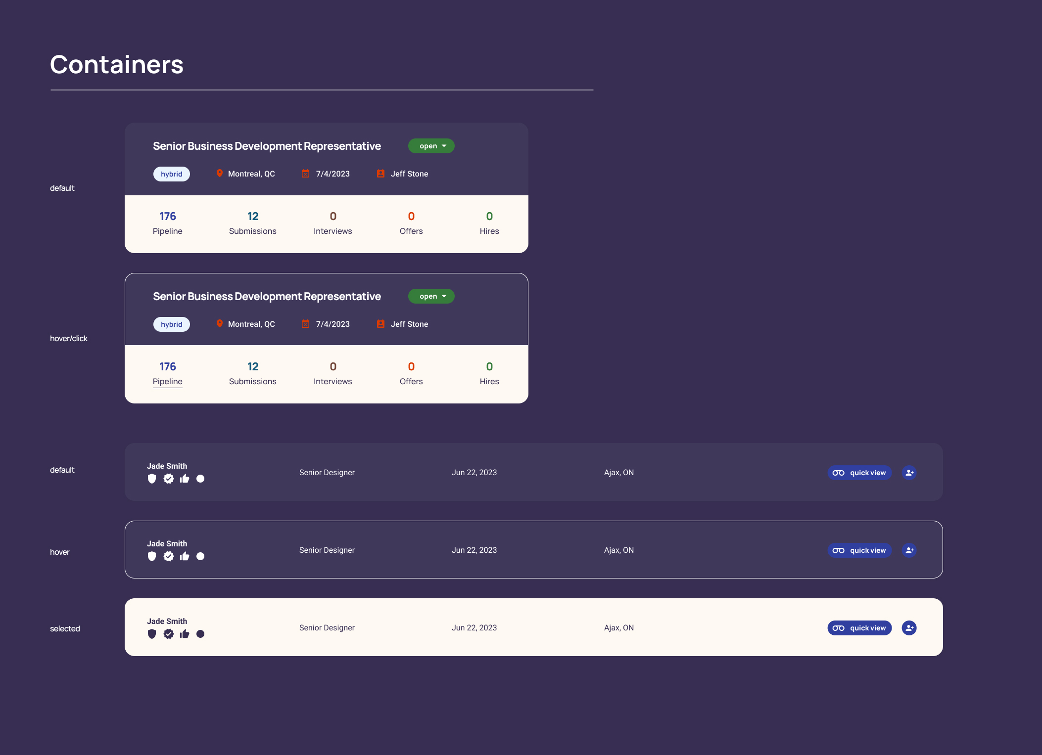
Containers
Built flexible container systems to organize content consistently, enhancing readability, modularity, and responsiveness across layouts.
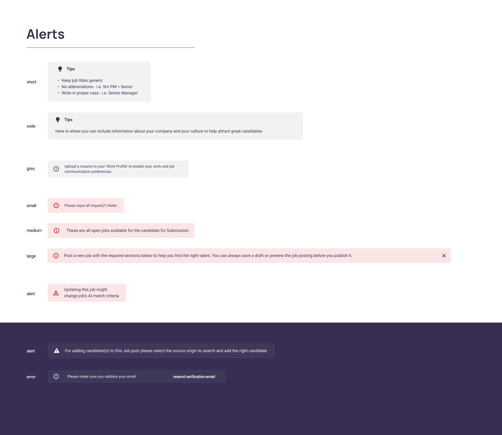
Alerts
Designed alert components to clearly communicate system feedback and important messages, using color and typography for quick visibility without overwhelming the user.
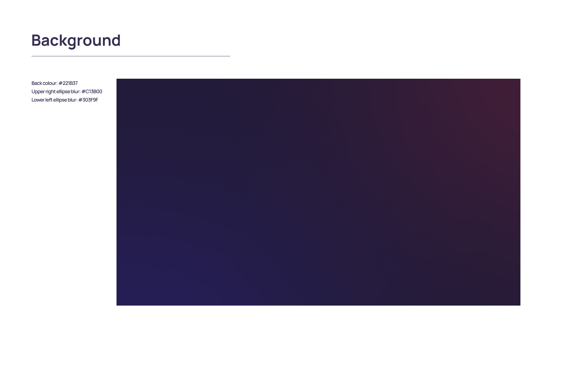
Background
Established clean, neutral background treatments to allow content and interactive elements to stand out while maintaining a professional tone.
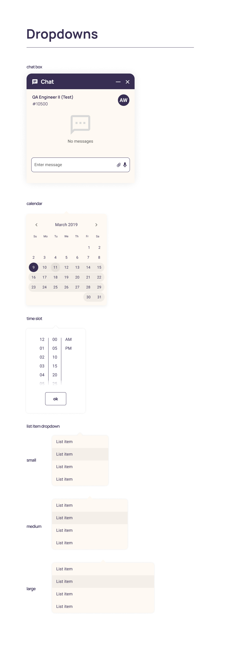
Dropdowns & Avatars
Created intuitive dropdowns for streamlined selections and designed simple, scalable avatar components for clear user and profile identification.
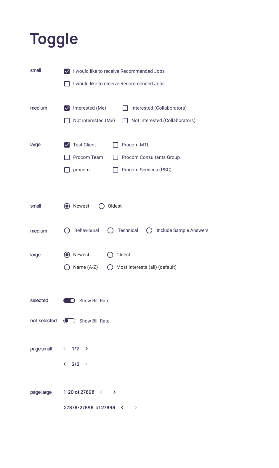
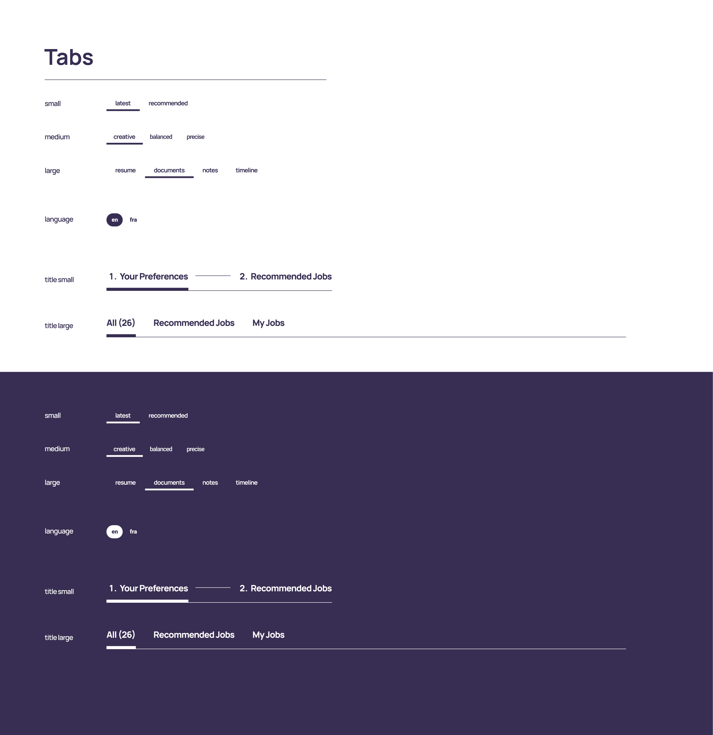
Toggles & Tabs
Built easy-to-use toggles and tab systems to help users quickly switch views or settings, improving workflow efficiency and discoverability.
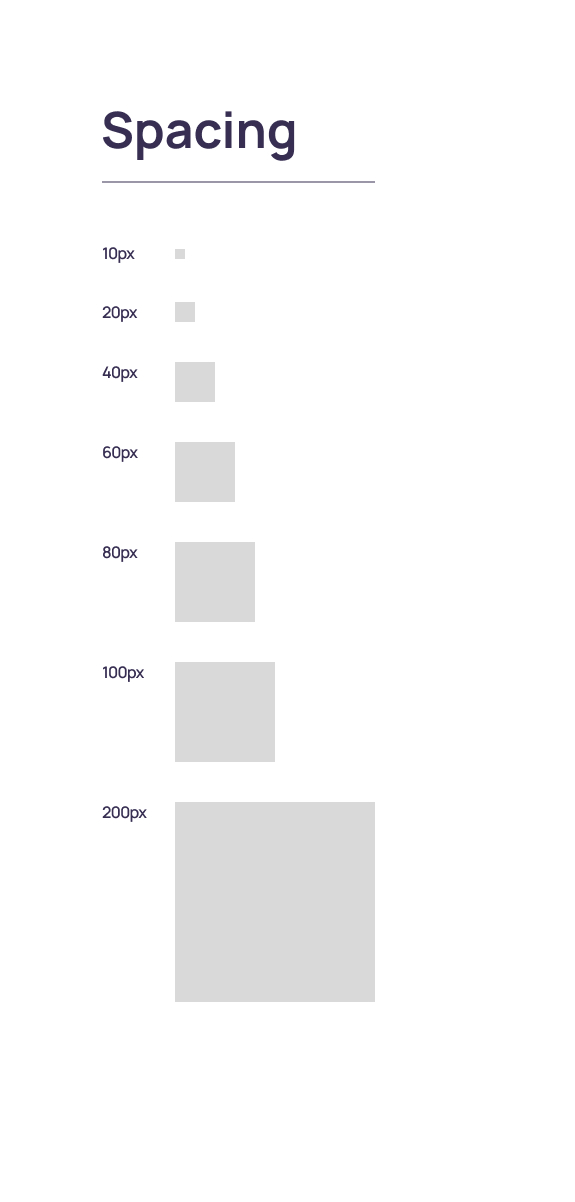
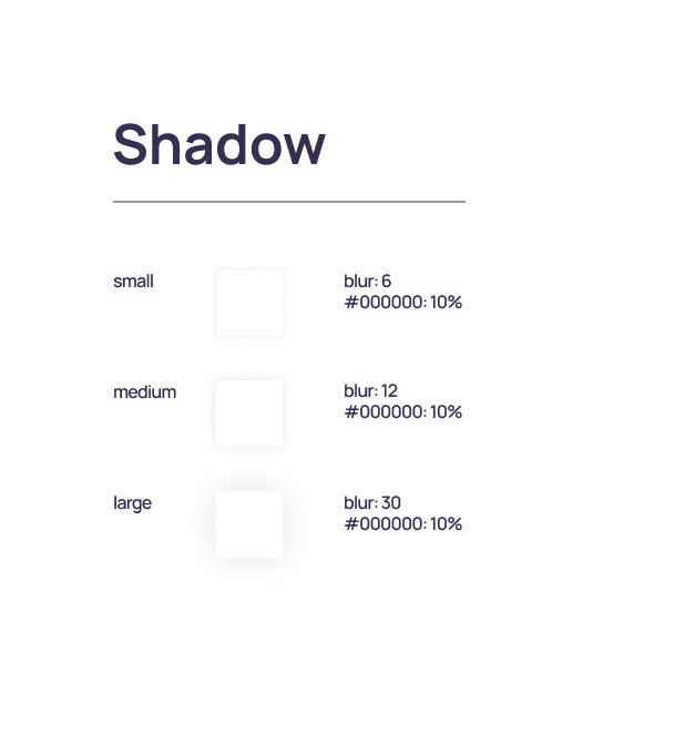
Spacing & Shadows
Defined a consistent spacing and shadow system to enhance structure, depth, and focus within the interface, making the UI clean, breathable, and modern.
CONCLUSION
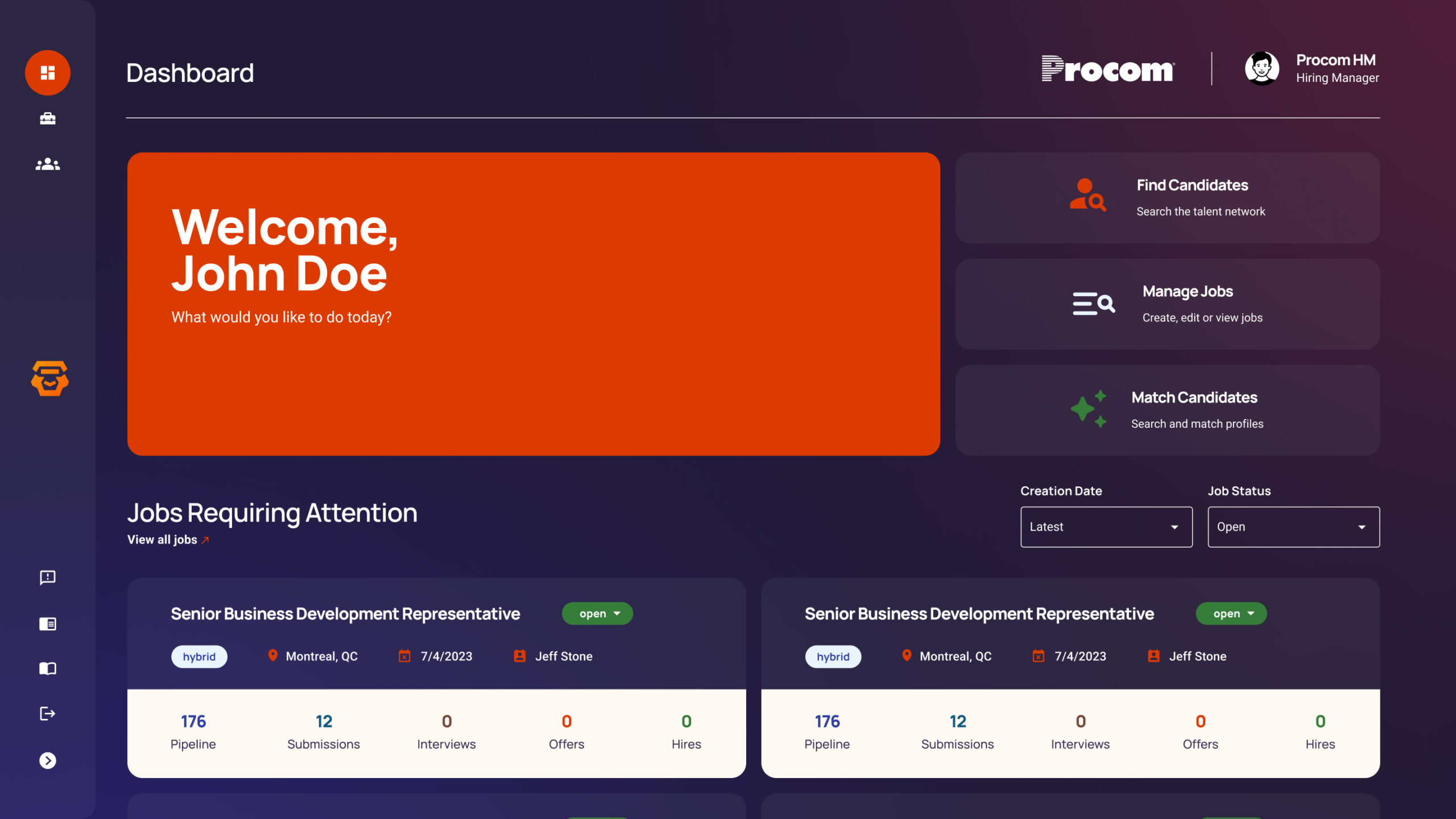
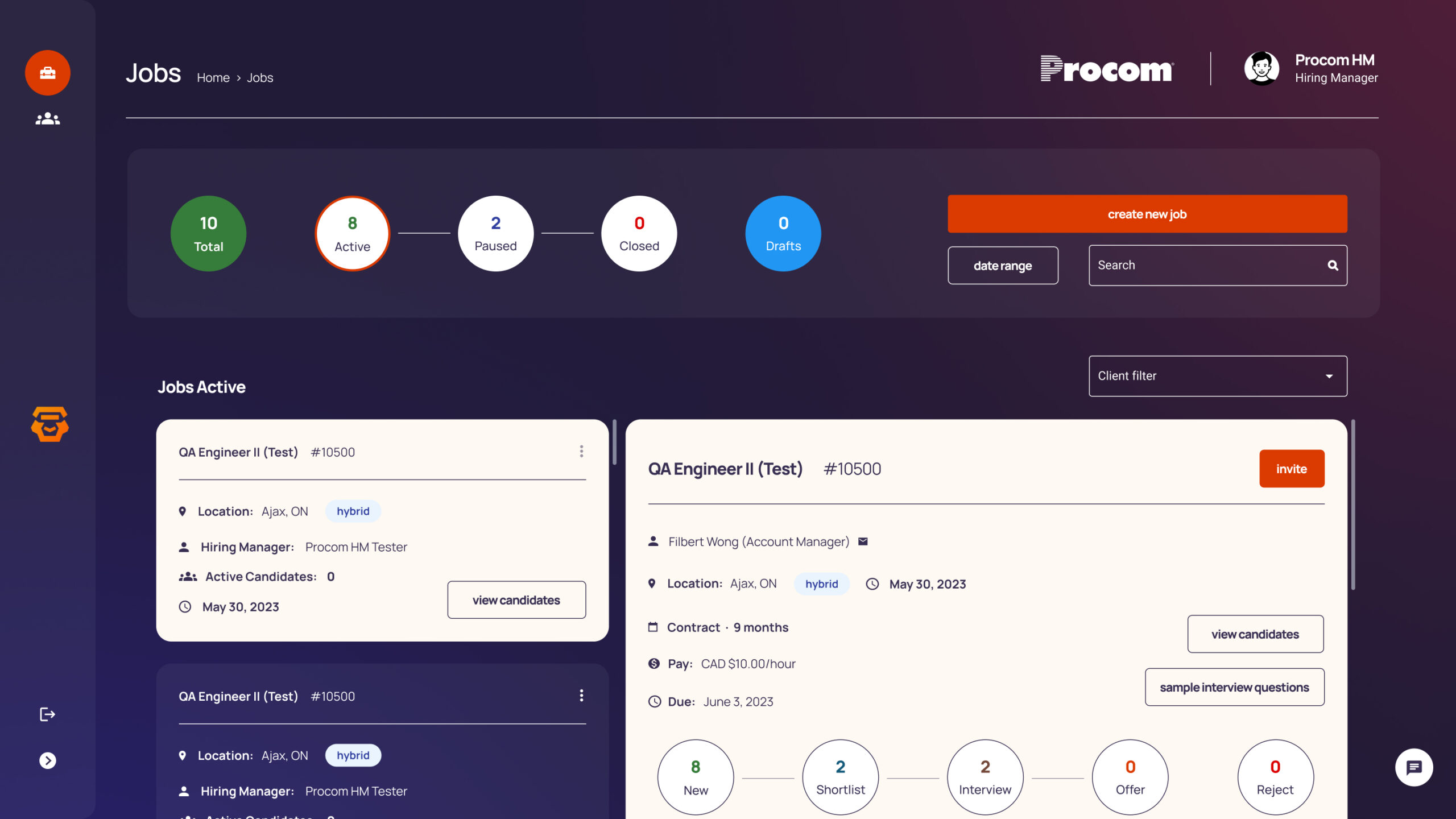
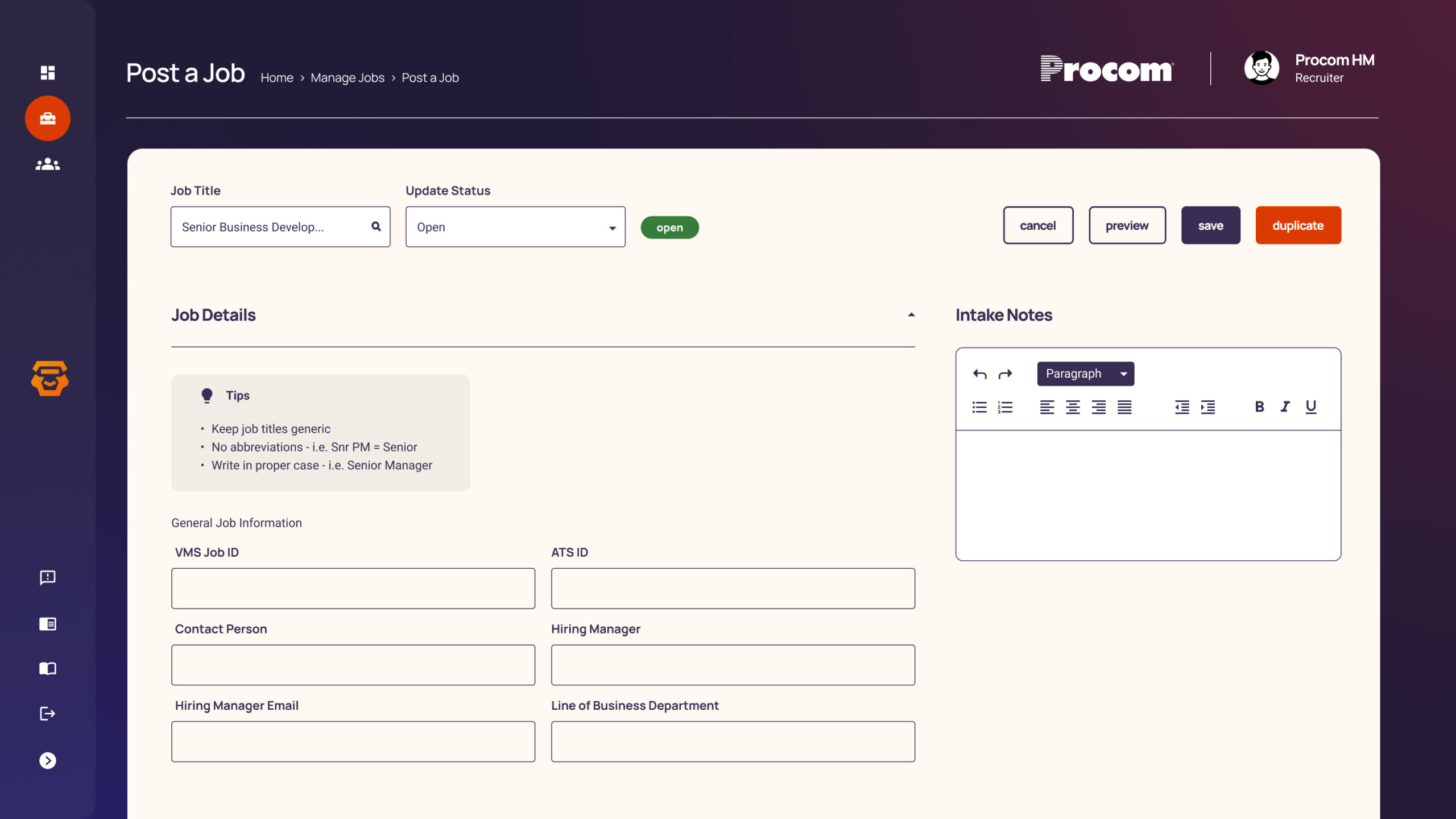
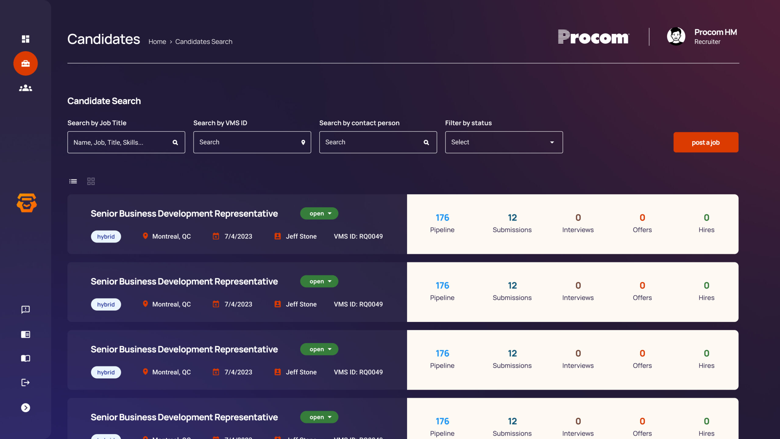
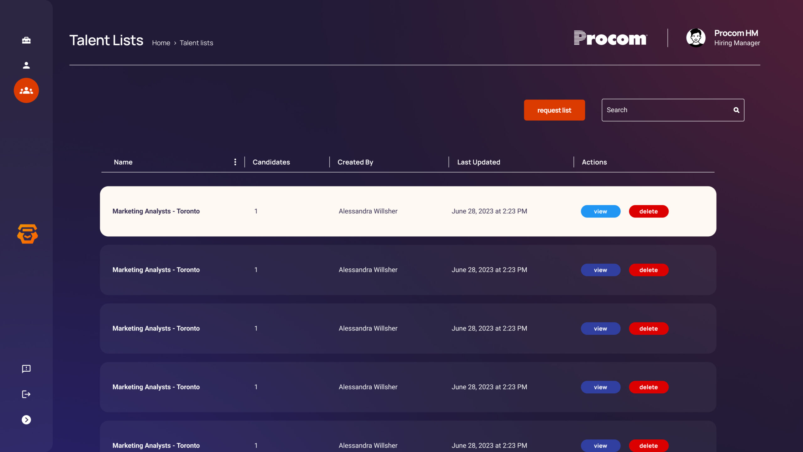
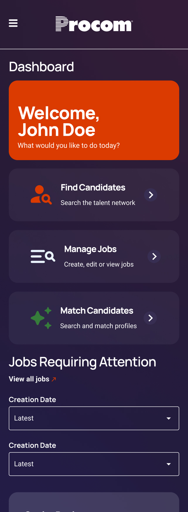
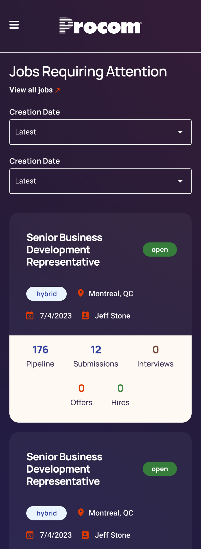
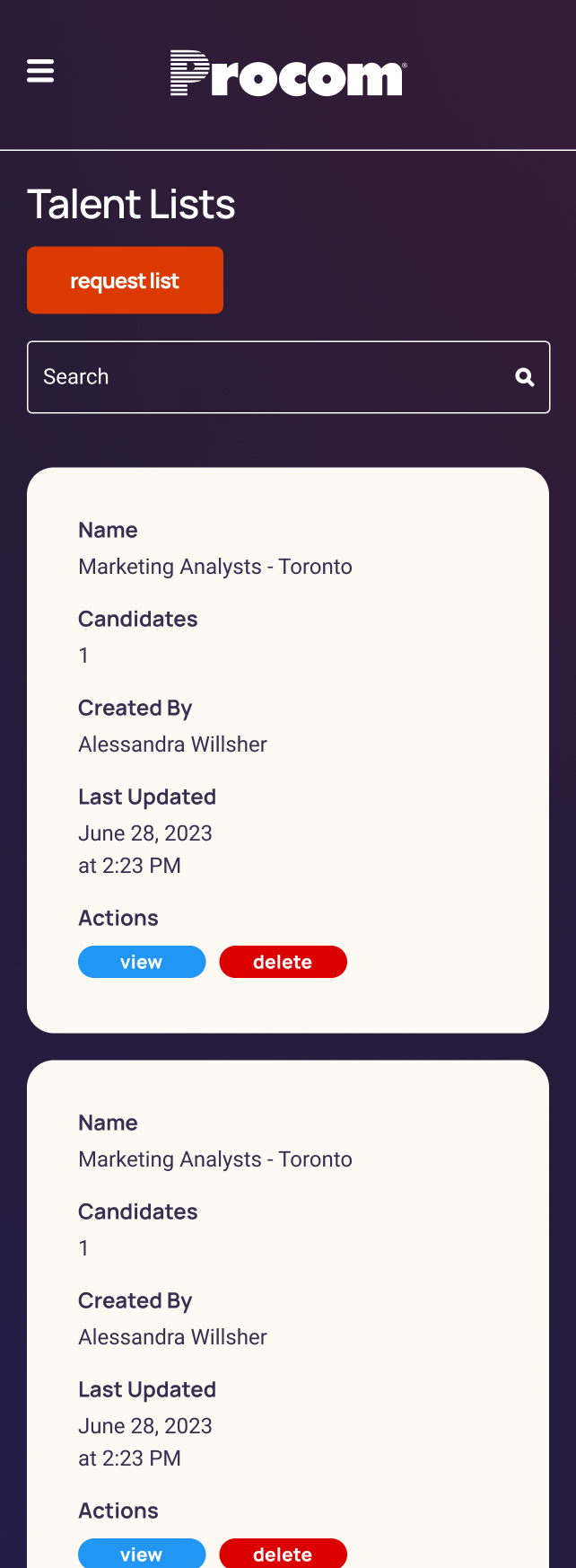
This platform was designed to serve hiring managers and recruiters by providing a streamlined, mobile-friendly experience for managing candidates and staffing operations. It seamlessly integrates with Bullhorn, one of the most widely recognized CRM and ATS systems in the recruiting industry, allowing users to work within familiar ecosystems while benefiting from enhanced workflows. Through thoughtful UX design, our team created a clean, intuitive, and accessible interface that made the platform easy to navigate and use for a wide range of users. By focusing on simplicity, functionality, and consistency, we helped deliver an experience that supports staffing professionals in working faster, smarter, and more confidently.
Mobile Friendly:
The platform was built with a mobile-first approach, ensuring a seamless experience across all devices. Since many hiring managers frequently use their phones to review candidates and manage tasks, we optimized layouts, navigation, and touch interactions specifically for smaller screens. This allowed users to work efficiently on the go, improving accessibility, speed, and overall satisfaction.